The World System Trajectory: The Reality of Constraints and the Potential for Prediction

Almanac: History & Mathematics:Trends and Cycles
Abstract
This paper discusses a number of constraints imposed on the trajectory of the World-System. Chief among these are the overall trend of the trajectory of the world system, the existence of lines of equal maximum urban area, that is iso-urban lines, constraints revealed by converting the trajectory to polar coordinates, periodic relationships within that representation, and the use of the ratio of observed maximum urban area to idealized maximum urban area to establish significant similarity with regard to two separate phases of urbanization including similarity in fractal dimensions of each phase. Beyond recognizing this suite of constraints, their potential for prediction of the state or position of the world system is discussed.
Keywords: de-urbanization, fractal dimension, iso-urban lines, optimum urban area, parametric equation.
In the employing of mathematical methods, however, biological facts must be reduced to a mere abstract of their real complexity. It is important to understand that this simplification is recognized for what it is: a working method. It does not mean to ignore the complexity and totality of biological relationships. These clearly remain the foundation upon which any mathematical model may be built.
C. C. Li, 1955
Acknowledgements
I wish to thank the following people for their comments and constructive criticisms: Andrey Korotayev, Sergey Tsirel, and Alexey Fomin. However, any errors or misinterpretations within the text of this paper are mine and mine alone. I wish to thank Kseniya Ukhova for her expert editorial hand.
Dedication: I wish to dedicate this paper to four scholars who have helped shape my thinking: the late Dr. Richard V. Bovbjerg, Dr. Robert DeMar, Dr. Elliott Speiss, and Dr. Dennis Bramble.
Introduction
Constraints on living systems are ubiquitous, and, if anything, the World-System should certainly be consider a living system. Constraints at the population level of biological organization have been documented formally for over 200 years a la Malthus, and mathematical formalism has been used to represent those constraints for almost as long. Verhulst in 1838 (as noted in Hutchinson 1978) proposed the logistic equation,
dN/dt = rN(1 – N/K), (Eq. 1)
as a reasonable model of population growth occurring within limits, that is within constraints, the constraint being represented by K, the carrying capacity. Further, although K was considered a constant by Verhulst and by many to follow who applied this equation to a variety of problems in population biology (for a review of the utility of this equation see Hutchinson 1978), the constraint itself can be seen to change, and in his insightful book, How Many People Can the Earth Support, Joel Cohen presents this extended model of population growth,
dN/dt = rN(1 – N/K) and dK/dt = [L/N]dN/dt, (Eq. 2)
where L is some threshold below which K grows by a factor greater than 1 and above which K grows by a factor less than one. Note that the growth of K does decrease continuously from N < L through N > L. In this more complicated model L represents then a second constraint.
The World System, at its most fundamental level, is a system of populations and is therefore it should be expected that the World System would be subject to the constraints imposed on population growth. In this light Korotayev, Malkov, and Khaltourina (2006a, 2006b, and 2006c) use a system of equations with the core of the system dependent on logistic-like constraints. Specifically, their system of equations,
dN/dt = aS(1 – L)N, (Eq. 3a)
dS/dt = bSN, and (Eq. 3b)
dL/dt = cS(1 – L)L, (Eq. 3c)
and the coefficients a, b, and c can also be seen as constraints on the system. The end result of applying this system is that as the World System grows it will reach an equilibrium established by L = 1. How rapidly the system reaches equilibrium will be determined by initial conditions and by the values of the three coefficients mentioned above. A further paper by Grinin and Korotayev (2006) demonstrated that the process of mega-urbanization exhibits similar constrained behavior. See their Diagrams 1, 3, 4, 7, and 10 which clearly suggest a strong and constraining relationship between the process of (mega-) urbanization, state formation, and associated territory and in fact show logistic-like behavior with the existence of plateaus punctuating periods of rapid, hyperbolic growth. Inspection of Diagrams 3, 4, 7, and 10 reveal not only logistic-like behavior but also more complex behavior than might otherwise be expected. (Also see papers by Korotayev [2010] and by Grinin and Korotayev [2006] for similar analyses.) Such complexities are in all probability emergent, that is in the manner of Anderson (1972) and of Mayr (1988), in that they are characteristic of the level of organization of the world system and not of its component parts.
It is on this level of organization of the World System, highly complex and urbanized, that this paper will be focused. The pattern of the trajectory of the World System, previously reported on by Harper (2010a, 2010b), exhibits both general trends and more complex finer structure, both levels of which exhibit constrained behavior. It will be the intent of this paper first to investigate these constraints and then to consider their potential for predicting the behavior of the system. Constraints will be considered from three different perspectives, that of the morphology of the graph in Fig. 1, that of a modified polar representation of the same data, and that of a comparison of observed maximum urban area and idealized maximum urban area. Once these different sets of constraints have been analysed, then the information that these constraints contribute to predicting the behavior of the system will be considered.
Finally, the research that this paper is based on was done in the spirit of the lead quotation from C. C. Li (1955). It is important for the reader, particularly those with little or no serious mathematical training, to understand that the simplifications used to make the Mathematics even somewhat tractable do not in any way devalue the detailed knowledge of the historian, but at once are both a consequence of that detailed work and also a context in which it is hoped the work of the historian and social scientist can be give new perspective. There is one more thing: mathematical reasoning may in many instances be the only way in which the emergent properties of complex systems can be revealed and understood.
The Organization of the Trajectory of the World System
This section will show that the organization of the world system trajectory as first described in Harper (2010a, 2010b) exhibits both gross structural trends and finer trends, all explainable in terms of urbanization, de-urbanization, and the constraint that maximum urban area places on the trajectory. There are clear trends at both the macro-level of organization of the trajectory and at finer scales that all suggest constraint and, as previously suggested, ultimately the potential for prediction.
Fig. 1 is a rotated version of Fig. 7 in Harper (2010b) in which the variable, ?, has been rotated to the y-axis and the variable, lnT, that is the natural log transform of the global population of the world system, has then obviously been rotated to the x-axis. This was done so that certain trends and characteristics of this trajectory would become more obvious than in the way these variables were originally displayed. In particular, some of the fine(r) scale characteristics are easier to understand, and this graphical representation also displays a non-obvious relationship between the two variables graphed and the natural log of maximum urban area size.
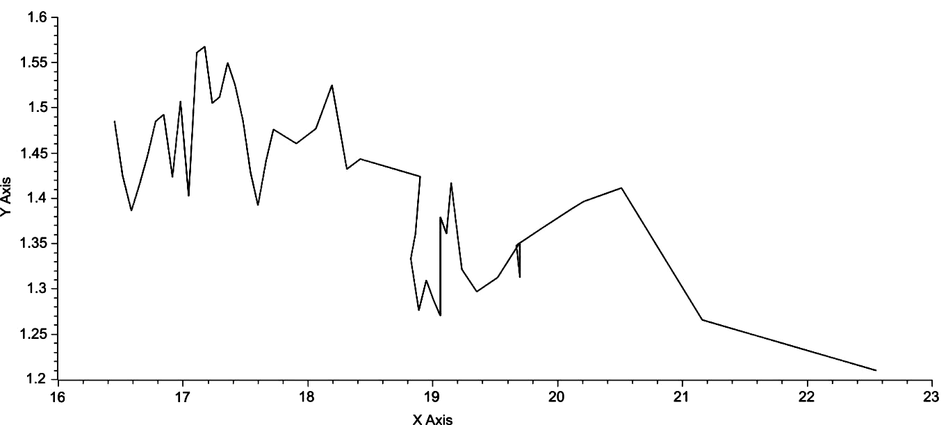
Fig. 1. lnT on the X-axis is graphed against ? on the y-axis
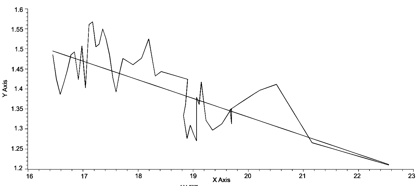
It can be seen by inspection of Fig. 1 that there is an inverse relationship between ? and lnT, since over the full range of lnT ? decreases from an initial value of 1.4851 to a final value of 1.2099, a difference of .2752 or a decrease of 18.53 % of the initial value of ?. Further, the largest values of ? occur with low values of lnT, for example, when ? = 1.5674, its largest value, the value of lnT is 17.1731, which is an increase of 4.37 % over the initial value of lnT, while the largest value of lnT, 22.5478, is an increase of 37.03 % of the initial value of lnT. Perhaps, an easier and more general method of demonstrating this trend of decreasing ? with respect to lnT would be to generate a linear regression of this data. This is done in Fig. 2, yielding the regression equation,
? = 2.23 – .0449lnT, (Eq. 4)
and the fit of this equation is quite good with r = –.708 and the RMSE = .0593. The fact that this equation has a negative slope clearly shows that the overall trend of the world system is one of decreasing ? with increasing lnT. What does this general trend imply?
Decreasing ? implies increasing urbanization. By establishing a fixed value of C, that is Ca, with respect to Cmax, a defined section of the triangular area bounded by the natural log transform of the equation,
F = ?C–? (Eq. 5)
can be arbitrarily defined as a boundary between urbanized and non-urbanized regions of the world system at a given time. By then holding A, the area bounded by
lnF = ln? – ?lnC, (Eq. 6)
constant and reducing ? it can be shown that the subsection of A bounded by Ca is greater than the subsection bounded by the original value of ?, and consequently represents an increase in urbanization. Note, that for any given time it can be shown that the ratio of urbanized to non-urbanized portions of the world system is given by:
U = (lnCm + x – lnCc)2/(lnCm + x)2. (Eq. 7)
As ? decreases with increasing lnT as represented by Eq. 4, it then follows that urbanization increases with increasing lnT. Modelski (2003) and Korotayev and Grinin (2006) have shown that urbanization has increased over time with the increase being punctuated by plateau-like phases and these phases appear to be synchronized with a similar pattern in global population, here labeled as T. It is a contention of this paper that the increasing population of the world system is dependent on increasing urbanization and would not occur without the process of urbanization and in turn its attendant process of technological progress.
Within this broad trend of decreasing gamma, increasing lnT and therefore T, and increasing urbanization are micro-trends only the average of which is reflected by these broad trends. While a detailed analysis, on a century by century basis, will not be entered into here, two significant micro-trends will be mentioned, the period from 400 BCE to 700 CE, essentially the formation, florescence, and demise of Rome, of the Han Empires and the mosaic of empires to follow the Han through to the establishment of the Tang Empire, and the origination of the Islamic Caliphates, and then the 12th to the 14th centuries CE. These two periods of time are significant, because they represent periods of rapid urbanization followed by rapid de-urbanization. Both are also associated with significant pandemics, with epidemic warfare, and with a variety of technological changes, for example, aqueducts in the West and the Grand Canal in the East to name two.
From 400 BCE to 100 BCE both East and West experienced very rapid urbanization, and if changes in gamma can be taken as an indicator of this trend, then over that period gamma decreased by .1460, or per century, .0487. These numbers may seem insignificant, but they are associated with a three-fold change in maximum urban area size from 320,000 in 400 BCE to approximately one million in 100 BCE. The reverse trend, increasing gamma over time, began in 200 CE with ? = 1.2699 and ended in 500 CE with ? = 1.3793, a change of .1097 or .0565 per century. With respect to change in maximum urban area size the decrease was from 1.2 million to approximately one-half million, or slightly less than a three-fold decrease. In the case of the 12th to the 13th century the changes in both gamma and maximum urban area size were less in absolute terms, but per century the change in gamma was .0486 accompanied by an increase in maximum urban area size of approximately one-half million, and the following century there was an increase of .0461 with a concomitant decrease in maximum urban area size of one-half million, almost exactly reversing the trend of the century before. What occurred over six hundred years in the period of Rome, Han et al. occurred in this second episode within a period of two hundred years, that is from 1200 CE to 1400 CE. (Note that the period from 100 BCE to 200 CE was not included, because it involved relatively small changes in gamma and urbanization and the detail at present of these changes does not add to understanding of the overall process of urbanization and de-urbanization.)
What also is significant is the fact that both sets of changes occurred during periods of relatively small change, sometimes negative, in the world-system population as a whole. From 400 BCE to 100 BCE there was a net loss of two million people from the global population, that is from 162E6 to 160E6, and from 200 CE to 500 CE there was no change in the population of the world system. While from 1200 CE to 1300 CE there was also no change in population, but in the succeeding century there was a loss of ten million to the total population. This all seems to imply that the rapid changes in urbanization followed by rapid de-urbanization, are directly associated with a static or negatively growing total population. To demonstrate this point using
Cmax? – Cmax – (? – 1)T = 0, (Eq. 8)
observed values of Cmax from 400 BCE through 100 BCE were used with held constantat 1.4239 to compute T, the total population of the world system for each century. These values are given in Table 1 below. As can be seen the observed values of T remain relatively constant, while the expected values for T as dictated by the pattern of urbanization constrained by ? = 1.4239 increase significantly. This implies that support of the pattern of urbanization with increasing maximum urban area size required much greater world system population size.
Table 1. Maximum urban area and gamma with respect to both observed and expected population sizes
| Century | Cmax | ? | TEXP | TOBS |
| 400 BCE | 32.E5 | 1.4239 | 162E6 | 162E6 |
| 300 BCE | 5.0E5 | “ | 306E6 | 156E6 |
| 200 BCE | 6.0E5 | “ | 397E6 | 150E6 |
| 100 BCE | 1.0E6 | “ | 822E6 | 160E6 |
A further implication of this difference between the observed and expected values of T then would be that the initial level of urbanization was somehow adjusted or adapted to an initial level or threshold of population, but when the process of urbanization continued but was not underwritten by continued total population growth, then after a time delay exceeding that threshold was followed by a process of de-urbanization that occurred until a reasonable steady state was re-established with respect to the total population.
Constraints Imposed on the Trajectory of the World System by Maximum Urban Area Size
Visual inspection of Fig. 1 will reveal that certain sets of points appear to be arranged linearly. As an example of a linear array a high-lighted region of the graph in Fig. 1 is depicted in Fig. 3.
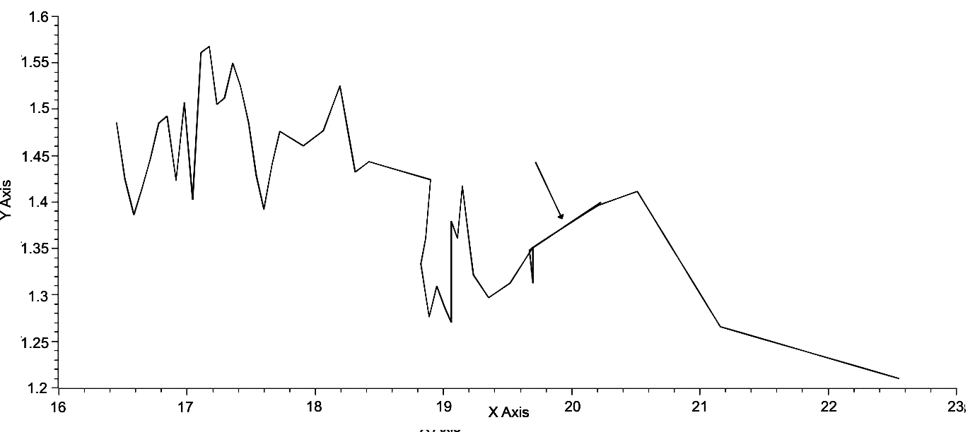
Fig. 3. LnT v. ?. Note the section of the graph indicated with an arrow. This section represents four data points as an example of a linear array of points
This linear array of points shares the same maximum urban area size, and it can be shown that other less obvious linear arrays embedded within this graph also share unique maximum urban areas; in other words, the arrangement of points in this graph is determined by and limited by associated maximum urban area sizes. Fig. 4 below shows three such sets, each with a line drawn through the set having an equation of the form,
? = mlnT + b. (Eq. 9)
Table 1 gives the set of all slopes and y-intercept values for each maximum urban area size, however, in several instances a specific point has a unique maximum urban area value, and for those cases a linear regression of all empirically determined slopes and of all empirically determine y-intercepts was used to determine the specific values of the slope and y-intercept for these unique maximum urban area sizes.
Fig. 4. This graph is similar to that of Fig. 1 but with iso-urban lines representing all positions of the world system with respect to ? and lnT for three specified maximum urban area sizes. All three lines have similar but not identical parameters for their characteristic equations
Table 2
| Maximum urban area size | Slope (m) | Y-intercept (b) |
| 1 | 2 | 3 |
| 4E4 | .115 | –.400 |
| 5E4 | .1120 | –.3940 |
| 6E4 | .1110 | –.4090 |
| 7E4 | .1090 | –.4410 |
| 8E4 | .1100 | –.4410 |
| 1E5 | .1060 | –.4110 |
| 1.2E5 | .1055 | –.4227 |
| 1.25E5 | .1037 | –.3986 |
| 1 | 2 | 3 |
| 2E5 | .1006 | –.4104 |
| 3.2E5 | .0980 | –.4393 |
| 4E5 | .0967 | –.4440 |
| 5E5 | .0948 | –.4532 |
| 6E5 | .0946 | –.4532 |
| 7E5 | .0938 | –.4560 |
| 8E5 | .0944 | –.4801 |
| 9E5 | .0927 | –.4614 |
| 1E6 | .0910 | –.4430 |
| 1.1E6 | .0918 | –.4614 |
| 1.2E6 | .0926 | –.4946 |
| 1.5E6 | .0906 | –.4723 |
| 6.5E6 | .0858 | –.5037 |
| 35E6 | .0828 | –.5308 |
Note: Numbers in bold face type were produced by linear regression of empirically determined slopes and y-intercepts. All slope and intercept values can be substituted into an equation of the form, ? = mlnT + b.
There are several consequences of this finding. First, it is entirely possible to determine the position of an ordered pair of values of lnT and ? as the position of that point must lie on the appropriate linear array, here referred to as an iso-urban line, as determined by specific maximum urban area size. Second, the set of all linear arrays falls on a complex curved surface as determined by the range of values of both slope and y-intercept. Third, this surface must be undulatory as slope and y-intercept values change with respect to maximum urban area size, while slope appears to decrease with respect to maximum urban area size, y-intercept values fluctuate, for example, the sequence from 4E4 through 2E5 exhibits continually decreasing slope values but decreasing then increasing then decreasing values of b. Fourth, the distance over which the world system moves is directly determined by maximum urban area. Fifth, since change in position of the world system from century to century can be represented by angular change with respect to a given iso-urban line and the actual distance moved, the world system trajectory can be represented by polar coordinates. This last aspect will investigated in the next section.
A Polar Plot Representation of the World System Trajectory
As was previously mentioned iso-urban lines can be used to generate a polar-plot of the world system trajectory. This was done in the following way. Local distance, defined as the distance from one point representing the position of the world system to a consecutive point was determined by the formula
d = [(?1 – ?0 )2 + (lnT1 – lnT0)2].5. (Eq. 10)
The continuous summation of d is represented by S = ?d. The angle of the distance vector, ?, was determined by finding the cosine of the angle between the local distance and the vertical distance from the previous iso-urban line to the following iso-urban line as determined be the value of the maximum urban area. Once this was done, the ratio of the vertical distance divided by the local distance is then used to determine the arc cosine. This angle, ?, is then summed continuously and is represented by
??= ?. (Eq. 11)
These parameters, S and ?, are then used in the parametric equations:
X = Scos?, (Eq. 12a)
Y = Ssin?, (Eq. 12b)
to determine the polar coordinates for each position of the world system.
Using the above procedure a polar plot of the world system was generated and represented in Fig. 5 below.
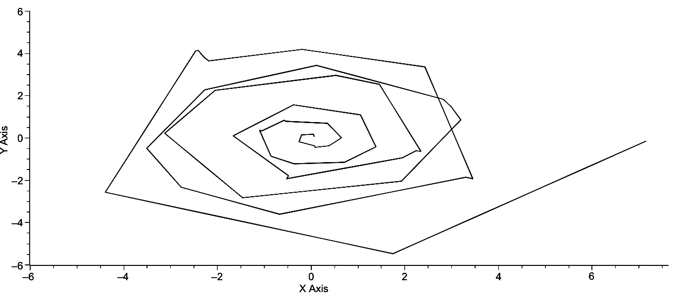
Fig. 5. A polar plot of the World System Trajectory. X = Scos?. Y = = Ssin?. This graph extends from 3000 BCE at the center most position to 2000 CE at the far right
Clearly, the overall form of the plot is that of a spiral with the initiation of the system at the origin which then spirals outward in a counter-clockwise fashion. Changes in the distance of the outwardly spiraling plot are a consequence of both changes in γ and in S, however, there are instances in which the magnitude of the change in one of these parameters over-rides the change in the other, that is where there is greater change in either ? or more likely, S, which would imply an increase or decrease in urbanization. It should also be noted that the distances from individual position (of the world-system) to individual position vary and are a consequence of the relative changes in both γ and S, and it is these positions collectively that bring about changes in ? and S. Further, change in ? represents change in lnT, and change in S represents change in the distribution of urban area sizes as represented by ?. It should also be quite apparent that the spiral plot is not a smooth one but is punctuated by a number of segments which unquestionably represent a shifting forward of the entire position of the spiral and, further, the changes in segment length cause the spiral at times to fold over on itself. From the perspective of Fig. 5 the trajectory of more recent spirals falls beneath the point on a previous spiral. This is due primarily to the paucity of data and the specific perspective of Fig. 5.
If the data used to produce the previous graph are supplemented with a time axis, that is the x-axis represents time, the y-axis represents X = ScosΨ, and the z-axis represents Y = SsinΨ, then a three dimensional polar plot of the world system trajectory can be created. Such a graph is represented immediately below and consists of a slight rotation of the graph in Fig. 5 to give the impression of depth.
|
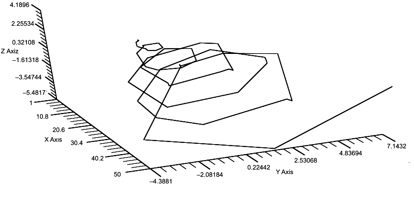
Fig. 6. This graph gives a 3D representation of the polar plot of the world system trajectory over the last 5000 years. The graph has been rotated to give the perception of depth with 3000 BCE being represented in the upper left of the graph and 2000 CE being represented on the far right hand side of the graph
There are three aspects of the graph in Fig. 6 that are immediately striking, the regularity of the spirals, the expansion of each spiral over the previous one, and the extended position of the last point, that of 2000 CE. As previously mentioned, however, further inspection of this graph will reveal that there are any number of instances in which the trajectory does not spiral but moves directly forward, for example, the sharp spike immediately to the left of the 2000 CE position. These periods of forward movement (in time) without rotation are best represented by rotation of this graph so that the y-axis is minimized as in Fig. 7 below.

Fig. 7. The z-axis has been converted to a y-axis and plotted against time. This is equivalent to rotating the graph in Fig. 6 so that the y-axis has been eliminated. The regions of the graph in which there is no rotation but only forward movement in time are represented by the (near) parallel setions to the x-axis
As is clearly apparent, the maximum and minimum y-axis values appear to be approximately linearly distributed, and, as to be expected, expand with time, since S is a summation of each movement, and there is clear regularity or periodicity exhibited by the maxima and minima. In turn, if the z-axis in Fig. 6 is eliminated so that Y = Ssin? is represented on the y-axis, the graph is Fig. 8 is produced, which differs little in over-all form from that in Fig. 7. It exhibits the periodically spaced maxima and minima exhibited by Fig. 7, all of which appear to be approximately linearly ordered with the exception one point, the last maximum, which is unquestionably positioned beyond any reasonable linear extension of the previous points. In other words, the current position of the world system with respect to its previous linear expansion is much greater than would otherwise be expected.
The regularity of the graphs in Figs 7 and 8 can be further investigated by considering the periodicity exhibited by these curves. The magnitudes of the maxima and minima of each are represented in Table 3 on the following page and their periodicities are represented in Table 4. It is quite clear from an inspection of the data in Table 3 that the maximum values for Scos? and Ssin? are offset by either 200 or 300 years (av. = 240 years), while the periodicities in Table 4 range from 700 to 900 years (av. = 833.3 years) and 800 to 900 years (820 years) respectively.
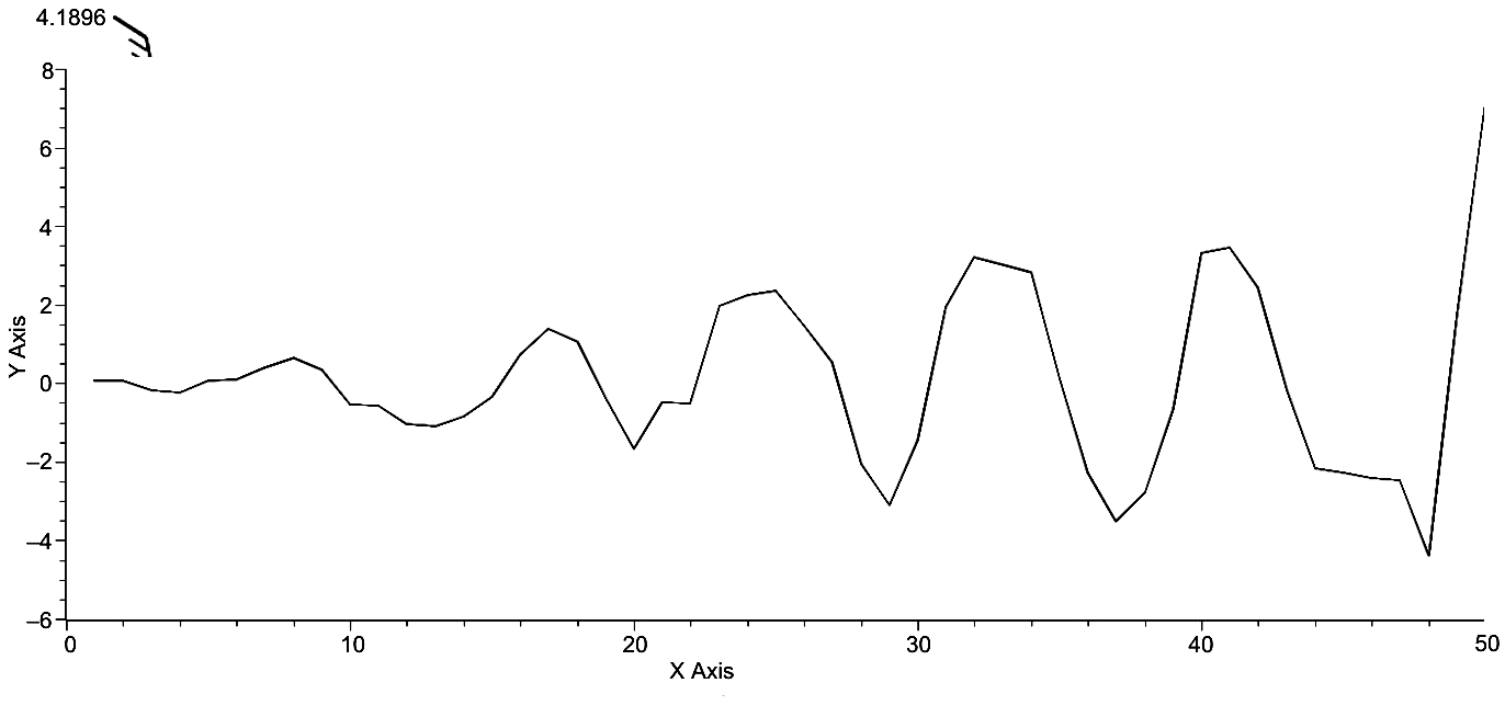
Fig. 8. Time v. Y = SsinΨ. Those regions of the trajectory without rotation are less apparent. However, the periodicity of the trajectory is quite obvious, as is the linearity of maximum and minimum y-axis values. Of significance is the extended position of the last point on the graph
Table 3
| Time | ScosΨ Max | Time | Scos? Min | Time | SsinΨ Max | Time | Ssin? Min |
| 3000 BCE | .0671 | 2600 BCE | –.2488 | 2800 BCE | .1577 | 2400 BCE | –.4392 |
| 2200 BCE | .6504 | 1800 BCE | –1.0405 | 1900 BCE | .8303 | 1500 BCE | –1.2398 |
| 1300 BCE | 1.3846 | 1000 BCE | –1.6646 | 1100 BCE | 1.5547 | 800 BCE | –1.9387 |
| 500 BCE | 2.3495 | 100 BCE | –3.1177 | 300 BCE | 2.9417 | 1 CE | –2.8417 |
| 200 CE | 3.1995 | 700 CE | –3.5077 | 500 CE | 3.4192 | 900 CE | –3.6111 |
| 1100 CE | 3.4538 | 1800 CE | –4.3881 | 1300 CE | 4.1896 | 1900 CE | –5.4817 |
| 2000 CE | 7.1432 | X | X | X | X | X | X |
Table 4
| ?Time | ?Scos? Max | ?Time | ?Scos? Min | ?Time | ?Ssin? Max | ?Time | ?Ssin? Min |
| 800 | .5833 | 800 | .7917 | 900 | .6726 | 900 | .8006 |
| 900 | .7342 | 800 | .6241 | 800 | .7244 | 700 | .6989 |
| 800 | .9649 | 900 | 1.4531 | 800 | 1.3870 | 800 | .903 |
| 700 | .8500 | 800 | .39 | 800 | .4775 | 900 | .7694 |
| 900 | .2545 | 1100 | .8804 | 800 | .7704 | 1000 | 1.8706 |
| 900 | 3.6894 | X | X | X | X | X | X |
Considering the crudeness of the data, these respective periodicities are approximately the same. Further, both the periodicities and the regularity of pattern of polar trajectory of the world system contribute to the support of the notion that the world system trajectory is highly constrained.
The data represented in Tables 3 and 4 can be visualized by putting both plots, those of Figs 7 and 8 on the same axes as in Fig. 9. In this graph it can be seen that the maxima of the solid curve that is X = Scos?, precedes the maxima of the dotted curve, Y = Ssin?, by approximately 200 years.
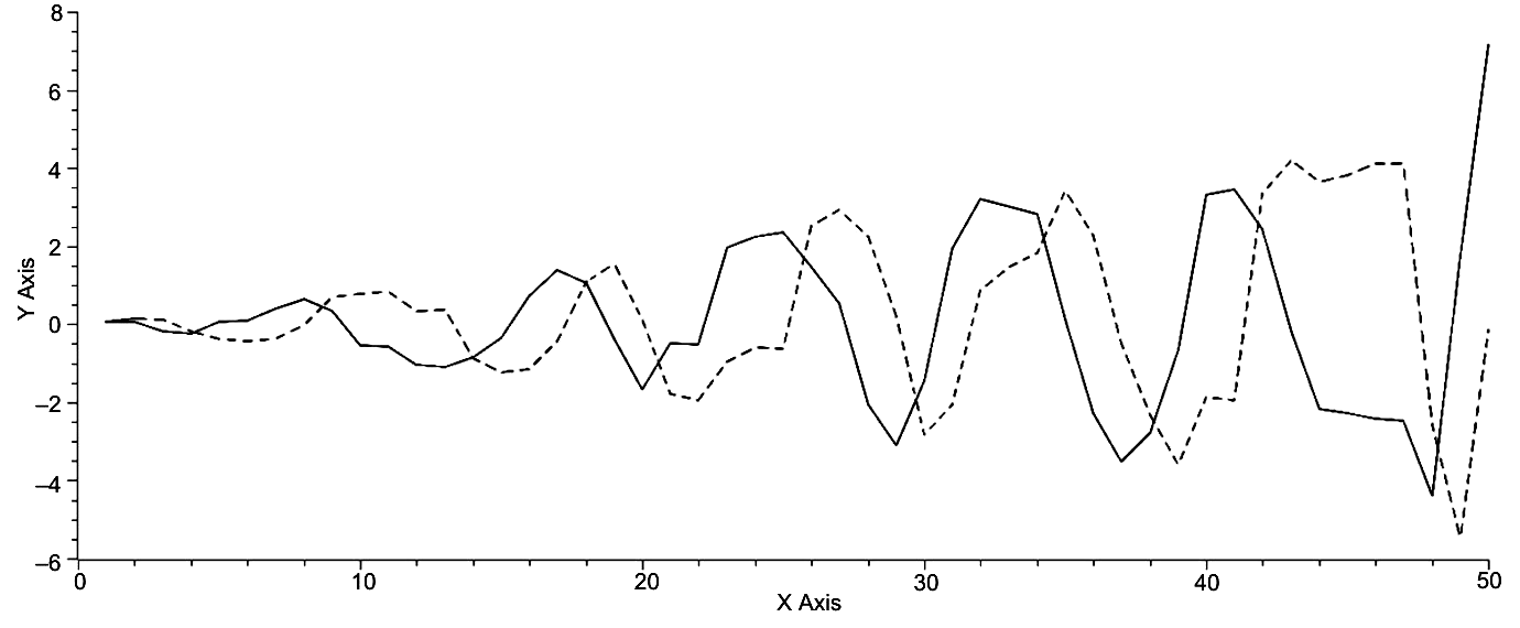
Fig. 9. Time on the x-axis and both X = Scos?, solid curve, and Y = = Ssin?, dotted curve, on the y-axis. While these oscillations are offset by approximately one-fourth of a period, they are not analogous to predator-prey oscillations, as both curves reach approximately the same maxima and minima per period, whereas the prey species would maintain a population level far below the prey species population, that is approximately one-tenth of the prey species population. The expanding oscillations imply that the world system as it is represented here is a non-equilibrium system
It is also apparent that the spacing of minima is more variable as noted in Table 4. If the overall pattern in Fig. 9 is compared with that of Fig. 5 it can be seen that the amplitude of the spiral in each graph increases over time and can be expected to continue increasing over time, the single and momentary exception of increase in S without increase in ? which will be addressed shortly. Given that in general the amplitude of the world system will continue to increase with some regularity, it can be accepted that this is supporting evidence for the world system being a non-equilibrium system.
If we now return to the graph in Fig. 9 and the data in Tables 3 and 4 and focus only on the maxima and minima in that graph and those tables, it becomes quite apparent that the maxima and minima occur periodically. What is the relationship over time of these maxima and minima? The periodicity of these maxima and minima is plotted against time in Fig. 10 below.
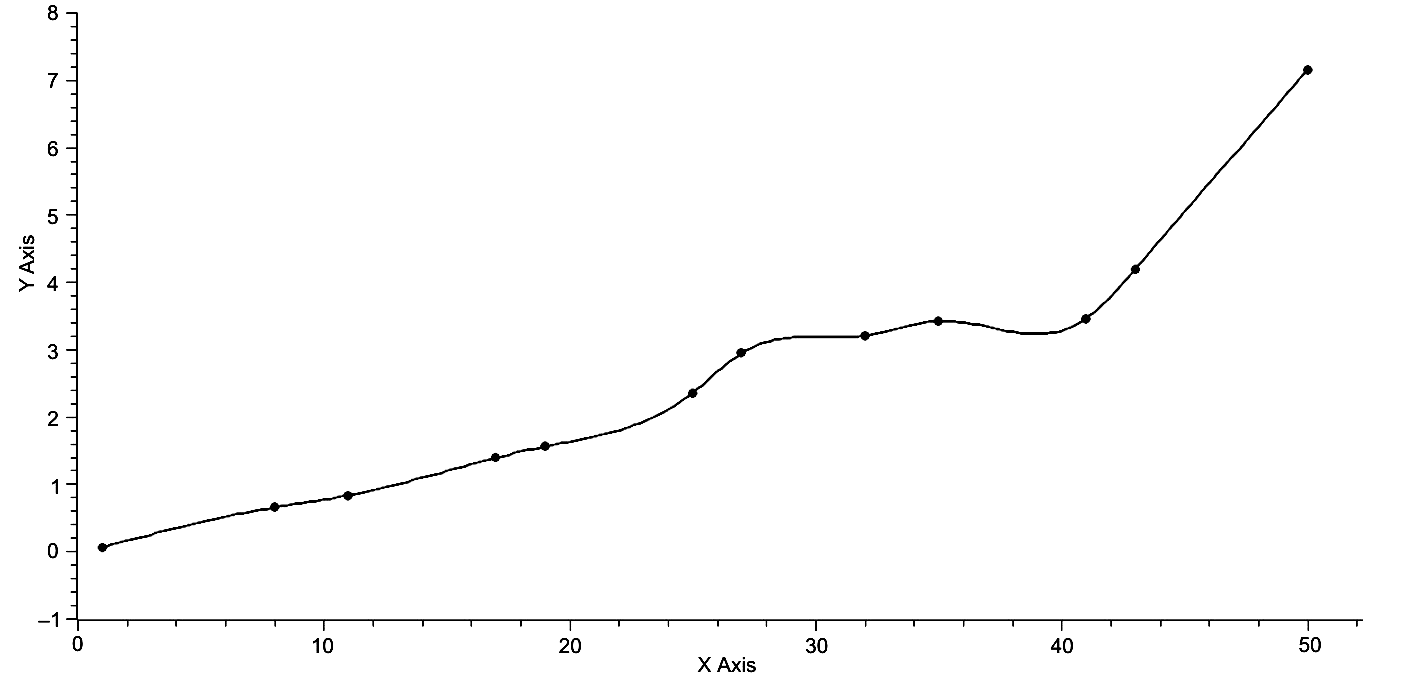
Fig. 10. Time is represented on the x-axis, and the magnitude of the maxima of both X = ScosΨ and Y = SsinΨ is represented on the y-axis. The periodicity of the maxima of both X and Y is apparent. This graph was created with the use of spline interpolation
Clearly, with the exceptions of the first and last point, the maxima for both X = Scos? and Y = Ssin? occur periodically as is visually represented below and noted in Tables 3 and 4. It is also interesting, and it is understood that extrapolation is a far riskier business than interpolation, that if this periodicity holds, then the second point beyond the one representing the maximum of 2000 CE, that is 50 on the x-axis below, will occur some 200 years into the future, and if one observes the overall pattern of the graph and notes that we have now entered a demographic transition, perhaps a comparison can be made between the current position of the world system and its position at 500 BCE, that is point 25 on the x-axis of Fig. 10. If this is a valid comparison, then it can be expected that some 200 years into the future the world system will be approaching a demographic plateau. It is noted here that this speculation goes counter to the thinking of a number of scholars, for example, von Forester et al. (1960), that plateau will be achieved this century.
If attention is now turned to the pattern of minima as represented in Fig. 11, it is again clear that these pairs of minima occur periodically and therefore predictably. The fact that there are six complete pairs of minima, as opposed to the five pairs of maxima and two singleton points is simply a function of the range of the data and the domain of the respective maxima and minima with respect to the current position of the world system. It is quite clear that while the most recent pair of minima will be succeeded by the next pair some 200 years into the future, there is no way to associate the most recent data directly with any demographic transition, as all minima are paired and as the most recent have no previously corresponding position for comparison.
Fig. 11. Time is represented on the x-axis, and the magnitude of minima for both X = ScosΨ and Y = SsinΨ is represented on the y-axis. This graph was created with the use of spline interpolation
The overall regularity of both polar plots can also be visualized by considering a plot of S v. Ψ, as is represented in Fig. 12.
Fig. 12. Ψ is graphed on the x-axis, and S is graphed on the y-axis. Note the near linearity of this graph with a linear regression yielding, Ψ = .0026S – .3128. R2 = .9521. Each vertical segment of the graph, and there are seven of them, represents a period of time when there was no change in ? but only in S
It can be seen that this plot, as represented by
Ψ = .0026S – .3128, (Eq. 13)
is relatively linear, R2 = .9521. However, there are pronounced non-linear aspects to this graph, and this amount to considerable positive changes in S with respect to ?, most probably phase changes in the system itself. Further, these phase changes occur in a two-step process, and there are three such two-step phase changes, 2000 BCE – 1700 BCE, 900 BCE – 300 BCE, and 900 CE – 2000 CE, this last amounting to 1100 years of change and the total amount of time associated with these changes is 2300 or approximately 46 % of the total time of recorded history. It should be noted that a single step change occurred from 2500 BCE – 2200 BCE and is the earliest example of such change.
If the axes in Fig. 12 are rotated so that S is represented on the x-axis, as in Fig. 13, an interesting pattern is revealed which is not apparent in the previous figure. Here it is quite apparent that periods of heightened increase in Ψ alternate with periods of increase in S. Specifically, from 3000 BCE to 900 BCE and from 400 BCE to 1400 CE, Ψ changes rapidly, but S changes moderately, while from 900 BCE to 400 BCE and from 1400 CE to 2000 CE represents periods of relatively rapid change in S, again with only moderate change in ?. These data are represented numerically in Table 5.
Fig. 13. S is represented on the x-axis, and Ψ is represented on the y-axis. Of note in this graph is the fact that periods of rapid change in S alternate with periods of rapid change in Ψ
In this table the per cent rates of change for both Ψ and S over their respective periods of change. For the first 2100 years of world system history the rate of change in Ψ is almost twice that of S, while in the next 500 years are reversed with S having twice the rate of change per century that ? does, and, again, for the next 1000 years the rate of change for ? is now approximately twice that of S. Finally, for the last 600 years the rate of S becomes three times that of Ψ. Of significant interest is the fact that the two time periods for rapid change in each variable are approximately the same, that is both periods of rapid change for ? are approximately a millennium in length, while both periods of change for S are approximately one-half a millennium in length. Of some significance is the fact that if increased changes in S occur over a period of one-half a millennium, then the world system should be entering another period of rapid change in Ψ which should last approximately 1000 years.[1]
Table 5
| Time Period | % ΔΨ/Time | % ΔS/Time |
| 1 | 2 | 3 |
| 3000 BCE – 900 BCE | 2.1511 | 1.2335 |
| 900 BCE– 400 BCE | 1.5251 | 2.9833 |
| 1 | 2 | 3 |
| 400 BCE– 1400 CE | 2.0104 | 1.0351 |
| 1400 CE– 2000 CE | 1.8356 | 6.7747 |
The focus of this paper will now be turned to the abstract distance traveled from point to point on the polar representation of the world system trajectory. These changes in spiral distance with respect to time are represented in Fig. 14. Segment length was determined by Pythagorean Theorem as in Eq. 8, where the parametric equations were used to determine X and Y values.
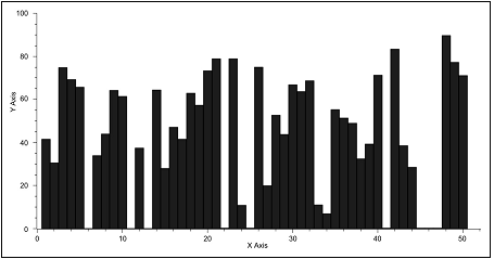
Fig. 14. Time is represented on the x-axis and spiral segment length as determined by the Pythagorean Theorem is represented on the y-axis. Note that the maximum size of segment length increases slightly with time. Also note that there are a number of instances in which segment length almost drops to zero. In fact, this is an artifact of the data and will be explained in the text
As can be seen below, there is a slight increase in average size of individual spiral segments over the 5000 years of world system history, and a wide range of values from almost zero to almost 90 is apparent.[2] Given that these near zero instances of spiral segment length exist, what is implied by their existence? Are they unique in world system history or simply artifacts of the data themselves? The idiosyncrasies of the graph in Fig. 14 are to some extent an artifact of the procedure to create the graph as opposed to the data themselves. Due to the fact that the data for S range from approximately .02 to 1.40, while the data for ? range from approximately 6.00 to almost 90.00, the procedure for computing segment length results in heavily weighting the values for Ψ over those of S. Even so, the question must be asked, to what extent does the graph reflect reality? In order to address this question both sets of data, those of Ψ and those of S, were normalized by their largest value. Using this normalized data the graph in Fig. 12 was produced. In fact, this graph exhibits the same general characteristics of the graph in Fig. 11, that is as light increase in average segment length over time and periods in which the size of segment length decreases precipitously. It should be noted that these minima represent instances in which there is no change from century to century in maximum urban area size, and as a result the component, S, is the only component to contribute to the summative process producing successive new positions of the world system. Returning to the comparison of the graphs in Figs 11 and 12, both graphs reveal the same general pattern.
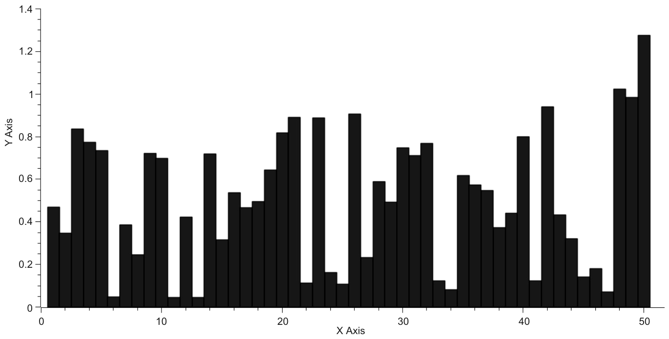
Fig. 15. Time is represented on the x-axis, and segment length is represented on the y-axis. The average size of the largest segment lengths remains relatively stable across time with a slight increaseover that same period of time. The instances of minimal segment length are pronounced as they are in Fig. 14
Considering only the component, S, the summation of the distance component in the polar plot of the world system trajectory, and plot it against time a near linear graph is produced as can be seen in Fig. 15. This graph shows clearly that on average S grows incrementally in a regular fashion, but with two pronounced exceptions where the slope of the graph changes abruptly. These are the period of time from 500 BCE to 400 BCE and also from 1800 CE to 2000 CE. In both instances the slope of the graph becomes markedly more positive, that is the rate of change of S increases. With regard to the most recent instance this change can be associated with the industrial revolution, however, with regard to the first instance of increased slope, one can only guess at a variety of technological changes of the time, a time when the Roman Empire was in its formative stage and shortly before the genesis and development of the Han Empire in China. If the slopes of the four respective periods, 5000 BCE – 500 BCE, 500 BCE – 400 BCE, 400 BCE – 1800 CE, and 1800 CE – 2000 CE, they are respectively: .0938, .4828, .0956, and 1.0261.
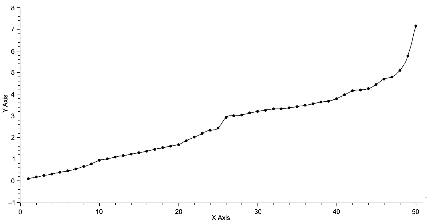
Fig. 16. Time is represented on the x-axis, and S is represented on the y-axis
This plot is effectively linear with the exception of the last 200 years of world system history, that is points 49 and 50. Even so, linear regression of this data gives:
S = .1102t – .2654 (Eq. 14)
with R2 = .9568.
Interestingly, the slopes of the two extended periods are approximately the same, while the slopes of the two transition periods are both significantly greater than the slopes of the extended periods, by a factor of 5.1471 for the pha- se change from 500 BCE to 400 BCE and by a factor of 10.7333 for the phase change from 1800 CE to 2000 CE, a period of change that may not yet be over. One further comment here, if the phase change is in fact over, do these data imply that the change in S will return to a more stately ~.09?
When a similar analysis is performed on ?, the summation of ?, the individual angles normal to specific iso-urban lines. Fig. 16 represents the graph of this data, and, most remarkably, the plot is effectively linear yielding the equation,
Ψ = 42.6751t + 22.3262, (Eq. 15)
with R2 = .9968. This graph is quite different from that of Fig. 15, in that it has a closer linear fit and that while there are divergences from linearity there are no significant instances of what have been labeled as phase changes but rather the divergences from linearity are distributed throughout the range of the graph. Appropriately, the next step in analysis is to compare the differences between observed and expected values of both S and Ψ, the latter as predicted by linear regression.
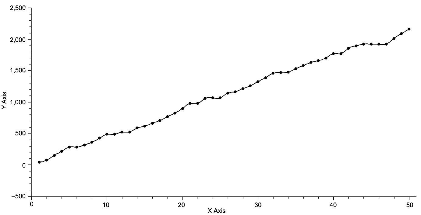
Fig. 17. Time is represented on the x-axis and Ψ is represented on the y-axis. Linear regression gives: Ψ = 42.6751t + + 22.3263, R2 = .9968
If the differences are taken between the observed values for both S and ? based on their respective linear regressions and plotted against time, the following two graphs reveal a periodic character to both plots. These graphs are represented in Figs 18 and 19. The first of these two graphs representing the difference between observed and expected for the variable, S, shows approximate periodicity with peaks at 100 BCE and (apparently) at 2000 CE. Both of these peaks represent times of rapid urbanization, the first matching the urban area growth approximating 1,000,000 succeeding the previous maximum of 600,000 one century prior and the second representing the incredible growth from 6,500,000 in 1900 CE to an approximately 35,000,000 in 2000 CE. Both of these instances represent events in which the maximum urban area size increases by approximately an order of magnitude, with the second maximum urban area increase associated with the change from the industrial to the post-industrial world system. The pattern of the graph in Fig. 18, that of the difference between observed and expected in the variable, ?, is more problematic with nine clear maxima with values greater than zero but excluding both the first and last points, 3000 BCE and 2000 CE.
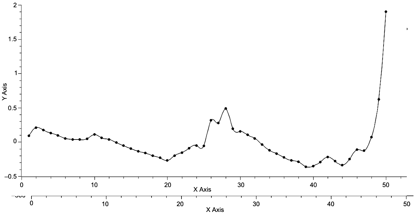
Fig. 18. Time is represented on the x-axis and the difference betweeh the observed value for S and the regressed value for S is represented on the y-axis
These maxima correspond to 2600 BCE, 2100 BCE, 1000 BCE, 800 BCE, 500 BCE, 100 CE, 600 CE, 900 CE, and 1200 CE. With the exception of 2100 BCE, which represents a new maxima for urban area size in the world system of the time, no other times represent unique maxima, although the maxima at both 800 BCE and 500 BCE represent instances of sequential new maxima, that is instances when the new maxima was maintained over a period of 100 years.
Fig. 19. Time is represented on the x-axis, and the differences between the observed values for Ψ and the regressed values for ? are represented on the y-axis
There is another unique characteristic of this particular graph, the minima at 1700 CE, which is the smallest minima, that is the greatest negative difference exhibited over the entire 5000 year history of the world system. This minima also precedes the greatest increase in maximum urban area size over the entire history of the world system.
In summary, this section has demonstrated the value of restructuring the world system data on time, log-transformed total population, and log-transformed maximum urban area population for a polar plot representation. First, the polar plot with time eliminated yields a counterclockwise outwardly spiraling graph that reveals the magnitude of contribution to the world system at any time throughout its history. When this graph is rotated appropriately its three-dimensional nature can be observed, and, on further rotation, the contribution and periodicity of each polar component can be evaluated. In turn, the periodicity of these components, S and ?, can be represented for both their maxima and minima. Then if S and Ψ are plotted against one another, both with S on the x-axis and ? on the axis, it can be seen that the last 5000 years of world system history have alternated periods in which change in Ψ and change in S were greater, usually on the order of a 2X factor, with the exception of this last period in which S was greater than Ψ by a factor of 3X. Differences between observed and expected values of both S and ? were calculated revealing peaks in ?S corresponding to about a 2500 year periodicity. The record for ? ? is less clear.
Optimal Urban Area Size аnd Observed Maximum Urban Area
In previous work there was no standard of comparison of observed maximum urban area other than the context of the temporal sequence that each maxi- mum urban area was part of. In this section a standard of comparison will be established, which will then be the basis of comparison per time step for each maximum urban area. In turn, any relationships revealed by comparative research will be analysed.
The theoretical maximum urban area size, here called the optimum urban area size, can be determined by recognizing that the natural log-transform of the equation, F = αC–γ (Eq. 5), represents the hypotenuse of a right triangle in log-space (see Fig. 14). Consequently, the area of this triangle is given by
A = .5γlnCmax2. (Eq. 16)
Further, the relationship between the sides of this triangle is an inverse one, that is if one side is increased by an amount, x, then the other is decreased by the same amount. Eq. 11 may then be rewritten as:
A = (γ – x)(1 + x).5lnCmax2, (Eq. 17a)
or
[γ + (γ – 1)x – x2].5lnCmax2. (Eq. 17b)
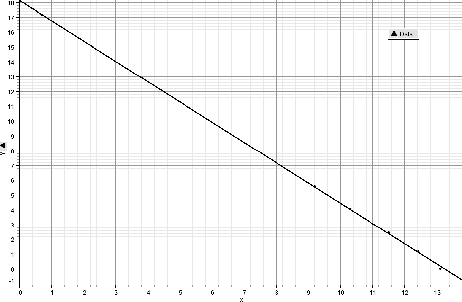
Fig. 20. This is a graph of the log-transformation of F = γC–γ, that is LnF = lnα – γlnC, for the specific values, C = 6E5, and γ = 1.3606
The graph of this last equation (see Fig. 15) is a parabola, concave down, and area is maximized at the peak of the parabola by the appropriate value of x.
It should be noted that for any given set of data the observed maximum urban area remains constant, so then finding the optimum urban area becomes a maximization problem in which the partial derivative of A with respect to x is set equal to zero, and then x is solved for. This gives the very simple formula,
x = (γ – 1)/2, (Eq. 18)
and on substituting into both (γ – x) and (1 + x) it is found that both of these terms are equal to (? + 1)/2 (Eqs 18a and 18b). In other words, maximization with respect to x requires that both sides of the triangle be equal, and this implies that the optimal urban area is determined graphically (and analytically) by [(γ + 1)/2]lnCmax, the anti-log of which is Cmax(? + 1)/2, the importance of this relationship will become clear shortly.
Given that the optimum urban area can be determined from readily available data (Harper 2010a, 2010b), the observed maximum urban area magnitude can then be compared with the optimum urban area magnitude. This will be done by generating the ratio, Cmax/Cmax(γ + 1)/2, for each point of the world system trajectory as it is represented by ?, lnCmax, and ln T. This graph is given in Fig. 3. The graph clearly exhibits two distinct phases, each about 2500 years in length separated by a brief period of transition.
Fig. 21. The above is a graph of Eq. 2 using the specific values of ? = = 1.3606 and Cmax = 6E5 or lnCmax = 13.3047
Note: the x-axis is for the range of x, while the y-axis represents A in Eq. 2. Further note, as long as the values of ? and Cmax are those determined by observation for a specific time, any (of those) values may be used (see Harper 2010a).
It is also apparent that the latter phase on average has a higher position than the former. This is a clear indication that the level of urbanization over the last 2500 years or so is greater than in the former period and implies a greater level of technology to support the greater degree of urbanization.
The graph in Fig. 16 may be divided into two equal segments, one from 3000 BCE to 500 BCE, and the other from 500 BCE to 2000 CE (see Figs 17 and 18). These separate graphs share some common characteristics. They both begin with a trend of increasing urbanization as defined by the ratio, Cmax/Cmax(γ + 1)/2, they both end with slight decreases in urbanization, and they both exhibit considerable oscillations between their initiation and termination. However, to give the reader perspective, the y-axis has been scaled to the same interval as the x-axis, and, as revealed in Figs 6 and 7, at this scaling the graphs are effectively linear.
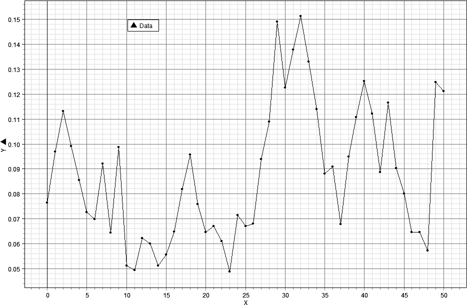
Fig. 22. The above graph represents the ratio of Cmax/Cmax(γ + 1)/2 over the last 5000 years of world system history. Very clearly there are two distinct phases, each about 2500 years in length, with a short transition period in between each
The graph in Fig. 16 may be divided into two equal segments, one from 3000 BCE to 500 BCE, and the other from 500 BCE to 2000 CE (see Figs 17 and 18). These separate graphs share some common characteristics. They both begin with a trend of increasing urbanization as defined by the ratio, Cmax/Cmax(? + 1)/2, they both end with slight decreases in urbanization, and they both exhibit considerable oscillations between their initiation and termination. However, to give the reader perspective, the y-axis has been scaled to the same interval as the x-axis, and, as revealed in Figs 6 and 7, at this scaling the graphs are effectively linear.
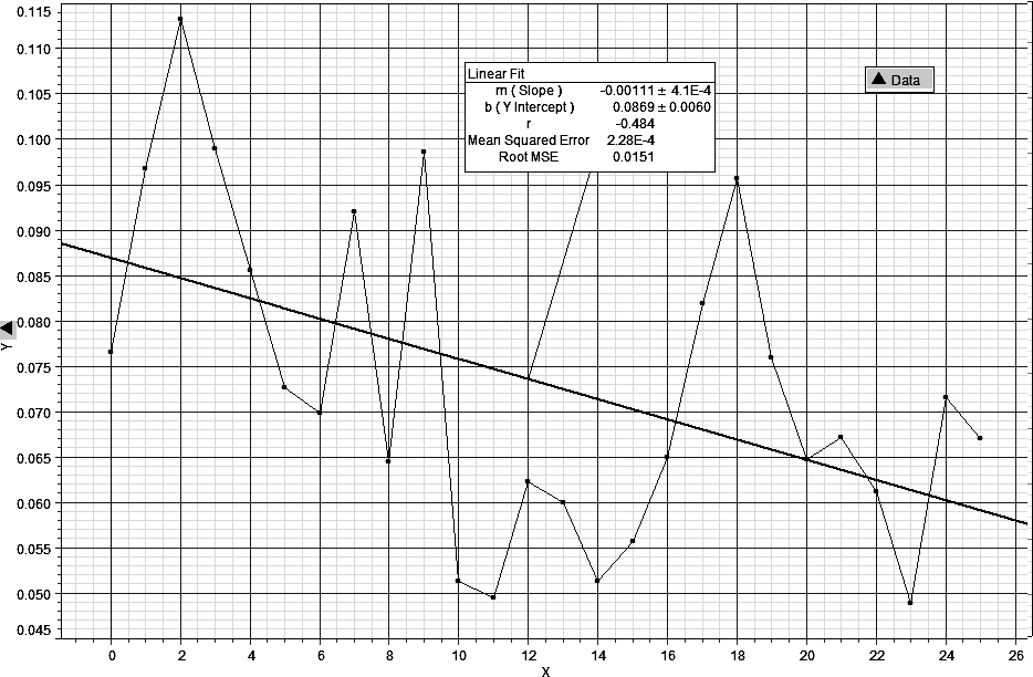
Fig. 23. This graph represents the first 2500 years of the time span represented in Fig. 3 and with an imposed trend line. The slope of the line is slightly negative, –.00111, and implies a decreasing ratio of Cmax/Cmax(γ + 1)/2 over that period of time
Fig. 24. This graph represents the second 2500 years of the graph in Fig. 3, again with an imposed trend line, also with a negative slope, –.00118, which implies decreasing Cmax/Cmax(? + 1)/2 over this latter time period
This point is being emphasized so that the reader will keep in perspective the actual magnitude of change represented by these graphs over their respective time periods of 2500 years.
Fig. 25. This graph represents the same data as in Fig. 17 but with the y-axis adjusted to the same scale as the x-axis. The intent is to give context to the actual magnitude of change of world system urbanization as represented by the ratio, Cmax/Cmax(γ + 1)/2
Fig. 26. This graph is of the data represented in Fig. 18 but adjusted so that both the x and y-axes are scaled the same as in Fig. 19
If linear regression is applied to both sets of data, that is data from both the first and second 2500 year periods, the respective linear equations,
CR = .0869 – .00111t, (Eq. 19)
and
CR = .148 – .00118t, (Eq. 20),
where CR represents the ratio, Cmax/Cmax(γ + 1)/2, and t is time. The slopes of these regression equations are effectively the same, differing by only .00008, implying similar rates of average change with respect to the changing magnitude of Cmax/Cmax(? + 1)/2 over the two respective 2500 year periods. This can be more emphatically demonstrated by looking at a composite graph in Fig. 27 of both regression lines. In this graph the lower solid line represents the average change in the ratio, Cmax/Cmax(? + 1)/2, for the first 2500 years of world system history, and the higher solid line represents the same for the second 2500 years of world system history. Both lines have been extrapolated by a dashed line to represent the full extent of the trend had the trend been extended over the full 5000 years.
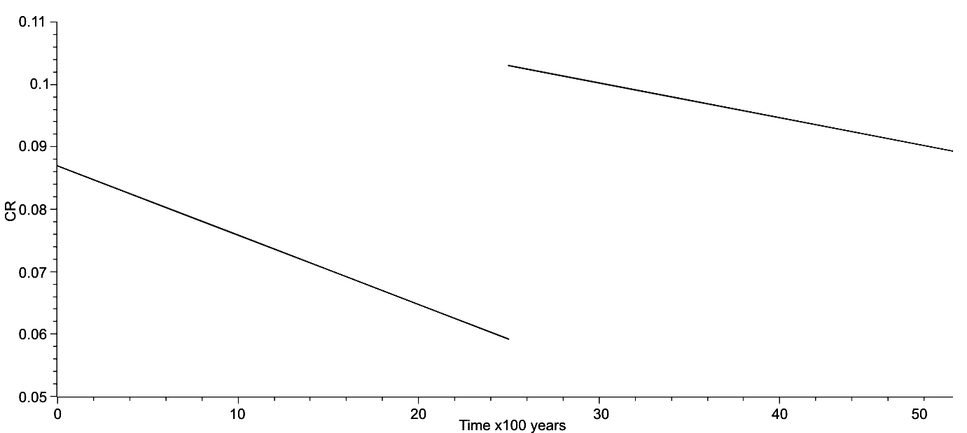
Fig. 27. This is a composite graph of the linear regressions in which the x-axis is time and the y-axis is CR, and in which the trend averages for the first and second halves of world system history as represented individually in Figs 17 and 18 are combined. Emphasized is the fact that the change from the trajectory of the first half to the second half, the solid lines of the graph, occurred relatively quickly and represents a significant change in the position of the world system
While the trend lines give the average direction of change, it is quite clear that the observed data are very different and exhibit change, as mentioned previously, that oscillates about each trend line. A two sample T-test was performed on the y-axis data of each set to see if there was any similarity in trend and the P-value for pooled data is 1.9926E-5, implying that the two sets of data are significantly different. This evidence is of course at odds with a visual comparison. For instance as mentioned previously but here more explicitly, such a comparison reveals that there is a 500 year decrease in Cmax/Cmax(? + 1)/2 prior to an upturn at the end of each time period, and there are other similarities. These patterns need to be investigated more thoroughly in future research.
A remark here needs to be made about both Grinin and Korotayev's research (2006), the research of Korotayev and Grinin (2013, and that of George Modelski (2003) with respect to world system phases, periodicities, and trends. The previous graph represents a single and quite rapid phase change from that of the Ancient World to the Modern World we now live in, and it suggests that regarding urbanization the data here imply that the Modern World began 2500 years ago. I would argue that that is the case only with respect to the ratio, Cmax/Cmax(γ + 1)/2, however, it does also suggest that our modern world has very deep roots, and that Arrighi's The Long Twentieth Century and other research on historical trends by a variety of authors (see above) are clearly prescient. Mention should also be made of L. S. Stavrianos' The Promise of the Coming Dark Age as a work of deep historical insight in the same vein as Arrighi's but with focus on the future.
Given that there is evidence for both dissimilarity and similarity of the data over each 2500 year subset, a very simple fractal analysis was performed to see if the fractal dimension of each sub pattern shared any similarity. This was done by determining the total distance in theoretical space of the world system trajectory for each subset, determining the length of the line segment of the regression equation for each respective time period of 2500 years, that is the lengths of the solid lines in Fig. 21, taking the natural log-transform of each, and dividing the log-transformed distance of the actual trajectory by the log-transformed regression distance. This gives the fractal dimension, here labeled D, or more explicitly,
D = ln?Co/lnCR. (Eq. 21)
C will be used to represent ?Co to simplify the symbolism. The anti-log of Eq. 18 is C = CRD (Eq. 19). When the dimension, D, was calculated for each subset of data, these values were respectively, D = 1.4853 for the first 2500 years, and D = 1.4870 for the second 2500 years. The difference between these two values is .0017 or approximately two one-thousands, quite slight. Unquestionably, these are important results, as they imply fractal similarity over different time periods of the same magnitude but with different histories, which further implies significant constraints on the trajectory of the world system.
As an extension of the metric used previously to represent world system trends, that is Cmax/Cmax(γ + 1)/2, this section will investigate the relationship between the theoretical area determined by the actual values of lnCmax and ln? and the maximum possible area determined by [(? + 1)/2]2lnCmax2. This involves producing a ratio of {(?lnCmax)2/[(? + 1)2/4) lnCmax2 )]}, which simplifies to Cmax^[(2? – ?2 – 1)/2] in the following way: Since (?lnCmax)2 simplifies to Cmax2?, and since [(?+1)/2]2lnCmax2 simplifies to Cmax^(?2 + 2? + 1)/2, then Cmax2?/Cmax^(?2 + 2? + 1)/2 = Cmax^2? – (?2 + 2? + 1)/2 which in turn equals Cmax^(2? – ?2 – 1)/2. Calculated values for this new metric were graphed on the y-axis against time in increments of 100 years over the past 5000 years of world system history to give Fig. 22 below. This graph represents two periods of fluctuation about a mean separated by a transition phase or phase change.
This period of phase change has been included within the bounds of both portions of the graph for convenience, but should be considered to span the time period, 700 BCE to 100 BCE, including what Karl Jaspers referred to as the Axial Age. If a linear regression is fitted to these graphed data the results are as represented in Fig. 23 below. It should be noted that the slope of the regression equation is quite small, m = .00450, in fact almost horizontal, and also that the actual fit of the data is quite good.
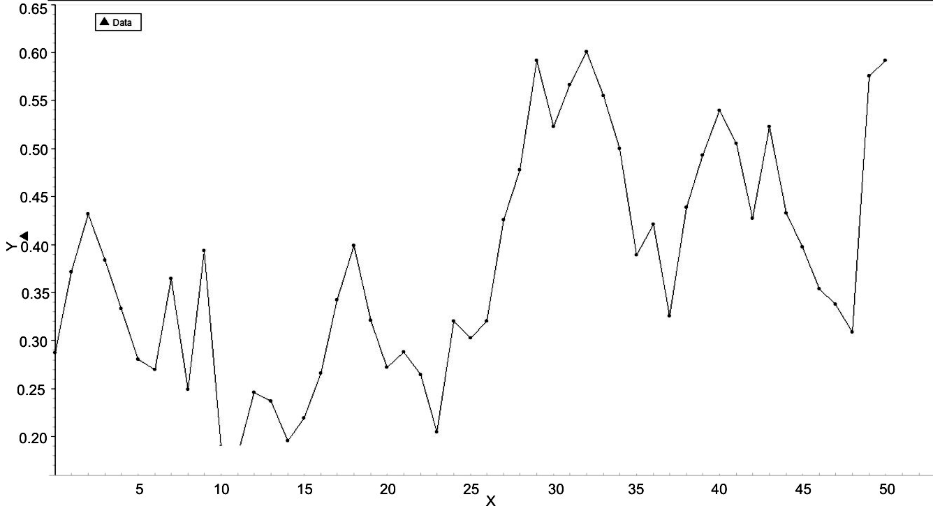
Fig. 28. Time in increments of 100 years for the 5000 years of world system history is represented on the x-axis, while values of Cmax^(2? – ?2 – 1)/2 are represented on the y-axis. Note that this graph effectively has two portions, one from 3000 BCE to 500 BCE and the other from 500 BCE to 2000 CE. These portions or segments of the graph will be analysed separately later in this section
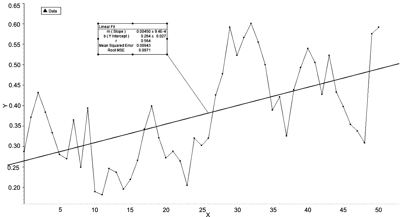
Fig. 29.
In this graph the data of the previous graph have been linearly regressed to produce the equation,
L = .00450t + .264, (Eq. 22)
having r = .564, and having an RMSE = .0971, where L represents the expression, Cmax^(2? – ?2 – 1)/2. The implications of this graph are that, while the correlation is acceptable but not strong, the RMSE, indicting goodness of fit is quite good. Further, there appear to be two distinct periods of activity of the world system, each spanning about 2500 years.
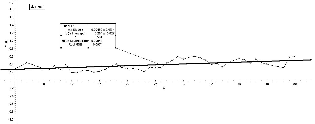
Fig. 30. This graph shows the relatively linear trend exhibited by the data represented in the previous graph and also the relatively close fit of the data to the regression line
To place the graph in a different and more appropriate context to show its linearity, the y-axis values have been expanded to –2, 2 in Fig. 30 above. This figure shows both the linear trend of the data plotted in Figs 22 and 23 and the closeness of fit of the data to the regression line. However, the representation of the distinct phases of world system activity separated by a phase change is blurred. What the above graph does reveal is the clear liner trend of world system history over the last 5000 years, which is, again, an indication of constraints operating on the system.
What is also interesting is that the graph of the entire world system history of the relationship represented by the term, Cmax^(2? – ?2 – 1)/2 does not require natural log transformation, so that changes in early world system history, say, during the first 1000 years or so, can be compared directly with any other portion of the data plot. With this in mind, it should be noted that the system change in the phase change noted previously represents an overlapping of system activity in that the greatest y-values of the first 2500 years are greater that the smallest y-values of the second 2500 years. What this may imply is that the second phase change may represent a similar overlap and can be predicted to extend to a y-value of approximately .85, which indicates that the world system has reached a level of activity which is 85 % of its theoretical maximum, no small consequence to contemplate.
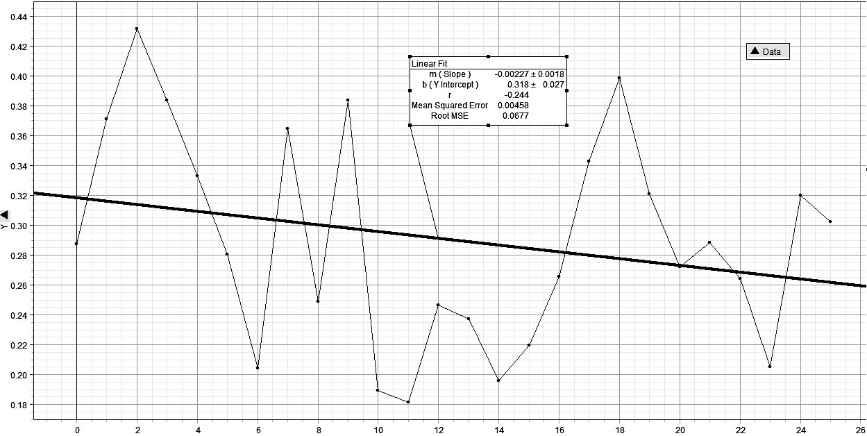
Turning now to a representation of the individual periods, the first 2500 years of world system activity are represented in Fig. 25 and including the regression line, show a slightly negative slope, m = –.00227, with a weak r = = –.244, but a significant RMSE = .0677. The second 2500 years of world system activity are represented in Fig. 26 with a slope, m = –2.22E-4, that is an order of magnitude less negative than that of the first and an RMSE = .0916 which is not significantly different from the RMSE of the first, that is RMSE = = .0971, representing a difference of .0055 between the RMSE's of the two regressions.
What is significantly different between the two regressions are the y-intercept values, the first being .264 and the second being .470. Clearly, while the slopes of both regressions are almost horizontal, the intercepts are quite different and can be represented in the composite graph in Fig. 27. This is not unlike the graph in Fig. 21, however the difference in the current y-intercept values is .206, while that in Fig. 21 is .0611, and the difference in the differences is unquestionably a function of the analysis in Fig. 21 being done at a single dimension, while that in Fig. 27 involves a two-dimensional analysis.
Х
Fig. 31. This graph is of Cmax^(2? – ?2 – 1)/2 plotted over the first 2500 years of world system history.The important aspects of this graph are that the slope of the linear regression is almost zero and that the RMSE is quite small
Further, the composite graph in Fig. 27 affirms the assertion made regarding the graph in Fig. 21, that of a distinctly different level of world system activity for the last 2500 years of world system history and also that the world system is in all probability in a phase transition to a new level of activity. This last assertion is based on the change in world system position for the last two positions represented in Fig. 26 which show a remarkable increase from 1800 CE, that is point 48 on the x-axis, to the year 2000 and also the assumption that phase changes occur approximately every 2500 years with respect to the metric, Cmax^(2? – ?2 – 1)/2.
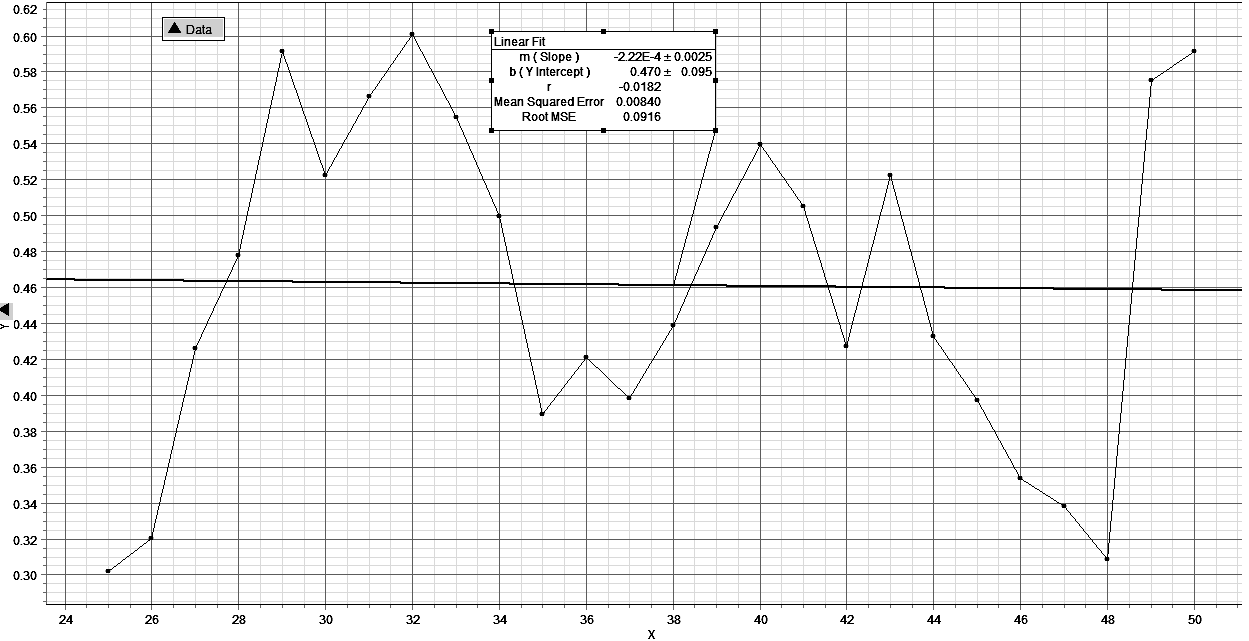
Fig. 32. This graph represents Cmax^(2? – ?2 – 1)/2 plotted over the second 2500 years of world system history, and, as in Fig. 27 has a very acceptable RMSE value and a slope approaching zero
Further, the composite graph in Fig. 27 affirms the assertion made regarding the graph in Fig. 21, that of a distinctly different level of world system activity for the last 2500 years of world system history and also that the world system is in all probability in a phase transition to a new level of activity. This last assertion is based on the change in world system position for the last two positions represented in Fig. 26 which show a remarkable increase from 1800 CE, that is point 48 on the x-axis, to the year 2000 and also the assumption that phase changes occur approximately every 2500 years with respect to the metric, Cmax^(2? – ?2 – 1)/2.
Of further importance is the considerable change in position of the world system at the 2500 year point. As it is represented in Fig. 27, it appears as a discontinuity in history, however, the reality is that continuous change, much of it over the Axial Age, brought about the new mode (and tempo) for the world system. One has only to take a look at Fig. 23 to see the nature of this phase transition, which is quite rapid, occurring over a period of 600 years, but hardly instantaneous! Exactly how this phase transition was brought about from a cliodynamic perspective should be the focus of future research.
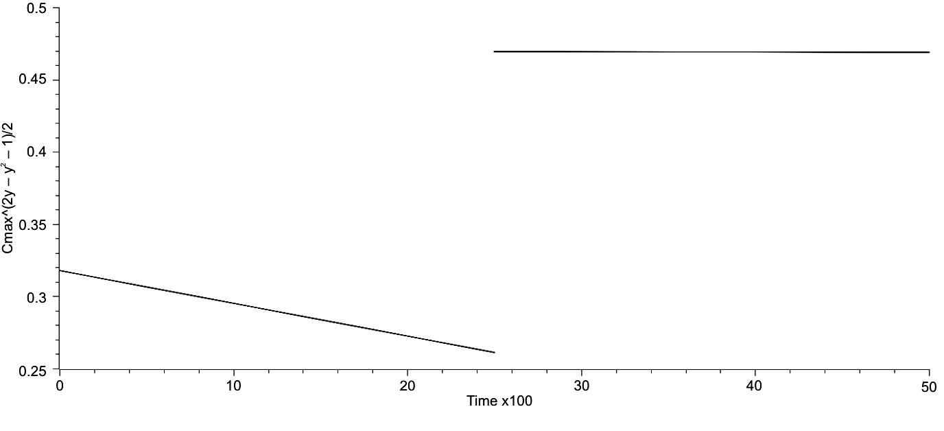
Fig. 33. This graph represents the trends of Cmax^(2? – ?2 – 1)/2 for both the first and second portions of world system history, both 2500 years in extent. Of note is the significant change in both position and slope of the second 2500 years
A rudimentary fractal analysis was done for the trends of Cmax/Cmax(? + 1)/2 over all of world system history, and the same will be done for the metric Cmax^(2? – – ?2 – 1)/2 over the same period of time using the same symbolism, see Eq. 19. When D, the fractal dimension, was calculated for both the first and second 2500 year periods and also for the entire extent of world system history the values computed were all approximately the same and did not vary significantly from linearity, that is D ~ 1. More specifically, D1 = 1.0029, D2 = 1.0036, and D3 = 1.0059. These values are effectively linear and suggest that the trajectory of the world system as represented by the regressions,
R1 = .318 – .0027t, (Eq. 23)
R2 = .470 – 2.22E-4, and
R = .00450t + .264, (Eq. 24)
Of Cmax^(2? – ?2 – 1)/2 over world system history, is dimension-limited and therefore a considerable constraint on the future course of that trajectory.
The Relationship between Maximum Urban Area and World System Population over the Last 5000 Years
The graph of lnT against lnCmax is given in Fig. 34 on the following page. There is a clear positive trend to the plot of this graph, albeit with some dispersion of points. It should be noted that the actual space occupied by this graph is quite restricted with respect to the phase space that it resides in. In Fig. 35, the same graph but with a best fit line, the aspect of linearity is more clearly defined, and the equation for this line is:
lnCmax = 1.0521lnT – 6.8404 (Eq. 25)
with an R2 = .9171, in other words, the fit of this line is quite good. It is hardly earth-shattering that there is a positive relationship between increased urbanization and the increased magnitude of the world system population over time, but the ability to give an explicit description to this relationship has some considerable utility. Even though the trend of this natural log plot is unquestionably linear, there are some significant departures from linearity, and there are also other characteristics of this graph that bear commenting on.
For the sake of communication it will be best to consider the graphs in Figs 34 and 35 to be divided into three regions, the first from 16.45 to 1nT = = 18.42, the second from lnT = 18.42 to lnT = 20.52, and the third from lnT = 20.52 to the right-most extension of the graph, 22.55. In Region 1 there are clear early (and tight) oscillations having periods on the order of 100 years that give way to more extended oscillations. The significance of these oscillations is that an increase above the mean position of the trajectory, as defined by the regression line, implies increasing urbanization, while a downward trend implies decreasing urbanization.
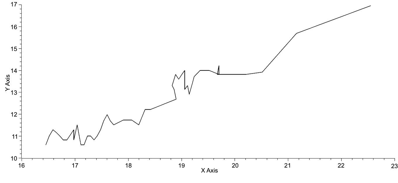
Fig. 34. X-axis is lnT, and Y-axis is lnCmax. The trend is linear with some dispersion of points
It could be argued that the relationship is only with maximum urban area, however, there is a clearly defined relationship between T and Cmax as represented by the equation: Cmax? – Cmax – (? – 1)T = 0 (Eq. 2). So, a change in the magnitude of Cmax also implies a change in the pattern of urbanization as reflected in the variable, ?.
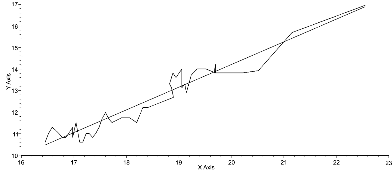
Fig. 35. Axes same as in Fig. 1. The regressed line is represented by the equation: lnCmax = 1.0521lnT – 6.8404. R2 = .9171
Considering the first segment of the world system trajectory from 16.45 to 18.42, which spans the time from 3000 BCE to 500 BCE, the key characteristic of this segment is the oscillatory nature of the trajectory and, in particular, the relatively width of the oscillations and their frequency. It could be argued here, especially through ~17.2, the world system was equilibrating from the emergence of the first empires. The trajectory rises quite rapidly through 17.6, a point on the graph representing the end of the Late Bronze Age, which is followed by a significant down turn, a mild rise and plateau, another slight down turn and then a rise to the end of this period. What characterizes this first half of the trajectory with respect to time, that is 2500 years, is apparent rapid urbanization which appears to overshoot the carrying capacity for that degree of urbanization and is consequently followed by decline. This segment is followed by a segment representing the next 2300 years of world system history.
The second segment of the world system trajectory is punctuated by two prominent events. The first of these begins with a very rapid phase of urbanization accompanied by stable or slightly decreasing world system population figures and begins in Figs 1 and 2 around lnT ~ 19.0. A maximum is reached after 300 years, followed by a slight decline and then a second maximum, which spans 300 years from 100 BCE to 200 CE. After this a second period of relative world system population stasis accompanies a decline in urbanization, spanning some 500 years. The total time period from the beginning of increased urbanization to the end of decreasing urbanization amounts to 1100 years. The second, although a temporally briefer event, represents a total excursion of 200 years from 1200 CE to 1400 CE, during which the maximum urban area population swung from 1.0 million to 1.5 million and then back again to 1.0 million with a slight decrease with world system population from 360 million at 1300 CE to 350 million at 1400 CE, due in large part to the ravages of pandemic plague.
The third segment extending from lnT = 20.52 at 1800 CE to 22.55 at 2000 CE represents similar change in the magnitude of the world system population but over a much shorter period of time, only 200 years. This massive excursion over a much shorter time period is unquestionably a product of the industrial revolution but more deeply a consequence of hyperbolic population growth (Korotayev et al. 2006a), which is itself a result of cooperative human interaction. If the ratio, ?lnT/?t, for each period, the values tell an interesting story. The values for the first two periods are respectively, 7.88E-4 and 9.22E-4, both within the same order of magnitude. However, the value for the third period is, ?lnT/?t = 1E-2, two orders of magnitude greater than either of the two previous periods and represents a rate of change of the world system that is unique in world system history. Further, during this period of rapid change there are no significant oscillations, no evidence of overshoot soon to be followed by rapid deurbanization. A caveat here, this present analysis documents change but does not ascribe a cost, either environmentally or economically, to that change, consequently, the footprint of the last two centuries, either in carbon or some energy unit, is not apparent. In perusing the Fig. 34, there is only one portion of that plot that bears any resemblance to this third segment and that is the portion from lnT = 18.42 to 18.90, that is from 400 BCE to 100 BCE, which was succeeded by a period of very rapid urbanization.
If attention is now turned to Eq. 1, it will be seen that the fit is quite good with respect to correlation, R2 = .9171, and the world system as reflected in a graph of lnCmax v. lnT has a clear primary direction that is both linear and positive. What are the implications of this positive linearity? First, it appears that each variable depends strongly on the other. It is important to emphasize that a large world system population is not simply a result of a large urban area population, just as it is important to avoid stating the opposite, that a large urban area is not a consequence of a large world system population. Both are interdependent on the other, and the fact that lnT is represented on the y-axis and not the x-axis is a result of choice by the author to emphasize the rapid changes in urbanization apparent in the second section of the graph. Second, the positive trend of the trajectory suggests that the near future state of the trajectory will in a general way continue to be positive. If the previous pattern of this trend is considered, specifically with respect to relatively significant positive change in lnT, then the section of the graph immediately prior to lnT = 18.90, that is at 400 BCE when T ~ 162E6, may be considered a reasonable analogue of the last 200 years of the World System trajectory. Following this period of increased lnT, was, as described previously, a period of rapid urbanization, followed by a period of relative stasis, and then rapid deurbanization. May the same be expected in the near future, that is relative stasis of lnT but a rapid increase in urbanization as characterized both by increasing lnCmax and decreasing magnitude of ?. From my perspective, this is a distinct possibility, as the rate at which the world system population is growing has been declining since the early 1960's, which mirrors the relative stasis of the population between 400 BCE and 100 BCE.
A Comparison of the Time Series of Both the Natural Log Transform of World System Population (lnT) and the Natural Log Transform of Maximum Urban Area (lnCmax)
When the plot of points represented in both Figs 34 and 35 is decomposed into two time series plotted on the same axes (see Fig. 3), a shared characteristic of both plots becomes apparent. They are approximately parallel to each other separated by an approximately constant distance. However, the upper plot, that of lnT, is far smoother with an almost linear component over the first 2500 years of world system history, a slight increase immediately after 500 BCE followed by another relatively linear component ending about 1000 years ago, which was in turn followed by slight oscillations over the next 800 years, and terminated by an abrupt upturn representing the consequences of the industrial and post-industrial eras. When these data are plotted on rectangular axes, the classic hyperbolic growth curve as noted by von Forester et al. (1960) and by Korotayev et al. (2006a) is produced. Without the advent of the Industrial Revolution the trajectory of the world system would be almost linear, reflecting exponential growth. Second, the positive linearity of these two variables suggests that the system as a whole will continue to move in a positive direction, which of course suggests constraint on the direction of the trajectory and also suggests the potential for prediction of the future position of the trajectory.
Linear regressions of each plot give respectively,
lnT = 16.2 – .0868t (Eq. 26)
and
lnCmax = 10.3 – .0904t (Eq. 27)
As can be seen by comparing values at t = 0, the equivalent of 3000 BCE and t = 2000 CE, the difference in regressed values at t = 0 is 5.9 and that at t = 50 is 6.08, so, as a general trend the difference has diverged over time. The implication being that a larger portion of the world system population lives outside the largest urban area, and in fact it could be restated as the largest urban areas, if the observed difference matches the expected difference. This, however, is not the case. The observed value of ln[T/Cmax] is 5.6000, which of course implies that a greater proportion of the world system population than expected due to regressed values resides in large urban areas.
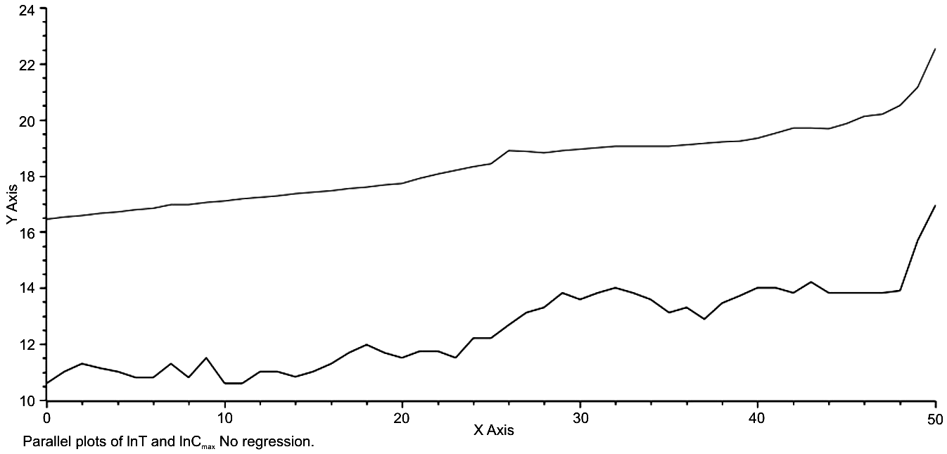
Fig. 36. Time is represented on the x-axis as a multiple of 100 years. The natural log transform of population size is represented on the y-axis with the top plot being that of lnT, the total population of the world system through the last 5000 years and the bottom plot being the plot of the natural log transform of maximum urban size, lnCmax, over the same period of time. The essentially parallel trajectories of both plots should be quite apparent, suggesting a very clear relationship between the two.
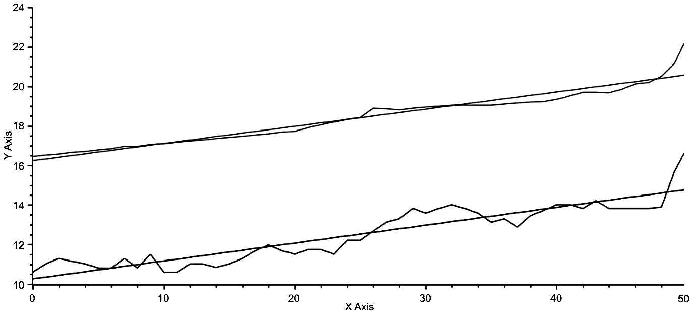
Fig. 37. The axes are the same as in Fig. 3, however each trajectory has been fitted by linear regression. The equation for the top regression is, lnT = .0826t + 16.1681, and that of the lower regression is, lnCmax = .0904t + 10.2681, where lower case ‘t’ = time, again in units times 100 years. The parallels nature of both plots is even more apparent in Fig. 4
If the values of ? are compared at each of the times, 1.4851 at t = 0 and 1.2490 at t = 50, it can be seen that a larger proportion of the total population would be expected to reside in (relatively) large urban areas.
A Model of the Difference between lnT and lnСmax
This parallel trend is relatively easy to model mathematically. Inspection of Figs 3 and 4 will show that lnT – lnCmax ~ 5.9, or more explicitly, lnT – lnCmax= = 5.9 – .0078t, where t = time. The anti-log transform of this equation is
T/Cmax = e5.9 – .0078t (Eq. 28)
or by rearrangement,
T = Cmaxe5.9 – .0078t. (Eq. 29)
While this is an empirically based model, an analytical model can also be derived. Recall Eq. 2, Cmax? – Cmax – (? – 1)T = 0. It is not too difficult to show that
T/Cmax = (Cmax?– 1 – 1)/(? – 1) (Eq. 30)
(see Mathematical Appendix) and therefore,
lnT – lnCmax = ln(Cmax?– 1 – 1)/(? – 1). (Eq. 31)
If the natural log-transformed right hand sides of Eqs 5 and 6 are equated, we have,
5.9 – .0078t = ln[(Cmax?–1 – 1)/(? – 1)], (Eq. 32)
and the left and right hand sides of this last equation, representing observed and expected values of the world system, can be regressed against one another (see Fig. 40).
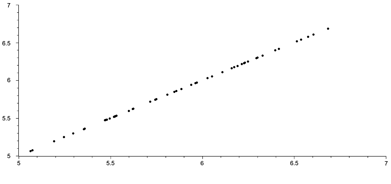
Fig. 38. Observed v. Expected re: ln[T/Cmax] = ln[Cmax?–1 – 1]/[? – – 1], where the left-hand side of the equation represents the observed, which is calculated from data on both T and Cmax, while the right-hand side of the equation is used to predict the left-hand side
It should be noted here that the above relationship is not unexpected, as Eq. 2 was used to generate values of ? with observed values of both lnT and lnCmax. However, it should also be noted that the left-hand side of Eq. 32 represents an alternative way of finding ln[T/Cmax], one in which the fit is quite good.
Interestingly, the essentially parallel trend of lnT and lnCmax over the last 5000 years suggests that there is a clear link between urbanization and total population growth. This in one sense is unsurprising, however, the contention here and in previous research is that link is in fact ?, the exponent characterizing the distribution of urban size given maximum urban size and total world system population.
The Potential for Prediction
The previous four sections of this paper have addressed the notion of constraints imposed on the trajectory, the historical trajectory, of the world system over the last 5000 years. A clear general trend with respect to the relationship between ? and lnT has been demonstrated, one that shows a decrease in ? and therefore an increase in the total distribution of the urban population, here defined as N ? 100, as the natural logarithm of the world system population and therefore the population itself increases. It has been shown that there are specific instances of change in the world system position in reaction to previous system change, e.g., the rapid urbanization of the world system from 400 BCE to 100 BCE followed by a rapid de-urbanization from 200 CE to 500 CE, that suggest that the system is being returned to some steady-state level. The existence of iso-urban lines has been established, lines of similar maximum urban area magnitude with respect to both ? and lnT, and the polar plot of the world system trajectory, the rather tight linearity between H and ?, H and time and ? and time, the periodicity between the observed and expected of the last two linear relationships, and the ratio of the observed maximum urban area value and the idealized one determined by maximizing Eq. 12a, A = (? – x)(1 + x). 5lnCmax2, which reveals that the urbanization of the world system appears to have occurred in two specific regimes, each with a similar rate of occurrence but with differing points of initiation, and which also demonstrates a fractal relationship for the two regimes that is effectively identical. All of these instances suggest that the world system is highly constrained, and, in turn, if this is in fact the case, that the behavior of the system, at least at the level of organization implied by the equation, Cmax? – Cmax – (? – 1)T = 0 (Harper 2010b), is (potentially) predictable.
Each of the above constraints will now be given more detailed analysis and explanation and then some discussion will follow with respect to the potential for prediction both in the past, that is retroactively, and for the system as a whole.
To begin, the fact that the linear relationship between ? and lnT has a negative slope suggests in general that for any given position of the world system future positions from that point on will involve both a decrease in ? and an increase in lnT, and over an extended period of time this is unquestionably the case. For example, the position of the world system in 200 CE is one in which the value of ? has decreased as lnT has increased with respect to the world system position of, say, 2000 BCE. However, if the position of the world system from 200 CE to 300 CE is considered, this is not the case, as there the change involves an increase in ? with no attendant decrease in lnT. In Table 6 below are documented all the changes in both ? and lnT and what this data reveals is that while two relationships predominate, there are several other arrangements between ? and lnT.
Table 6
| ?/lnT | +/+ | +/0 | +/– | –/– | –/0 | –/+ |
| Number | 22 | 3 | 1 | 2 | 1 | 21 |
As is represented above on a century by century basis then depending where one starts the actual trend of change in ? with respect to lnT may fall into one of six categories.
What is to be made then of the negative slope of the equation
? = 2.23 – .0449lnT? (Eq. 33)
This unquestionably has to be an emergent property of the system itself and as such is only of general predictive value. Of more importance is the fact that the dispersion of points about the trend line is that the greatest variance is approximated by ~.1?. This fact along with the negative slope have some predictive worth in that bounds are placed on future changes in position of the world system from any previous point. A note of caution here: There are at least two instances in which lnT, and therefore T, the population itself, decrease, the first during the period of intense urbanization from 300 BCE to 200 BCE and the second from 1300 CE to 1400 CE, the (calamitous) 14th century, and these population deficits were quite small.
It is to these two specific instances, the period of rapid urbanization at the end of the first millennium BCE and the 14th century and the periods of adjustment that followed them, that attention will now be given. Both of these periods of time share the same pattern of development and response, that is both represent periods of intense urbanization directly associated with little or no negative change in total population followed by rapid de-urbanization, in the case of the first period, punctuated by a brief period of de-urbanization followed by a short period of urbanization. It appears then that rapid urbanization constrained by zero world system population growth results in equally rapid de-urbanization, either directly or followed by some relatively short period of time.
To give a numerical explanation for the above phenomenon Eq. 23 from Harper (2010b) was used to calculate the ratio of urbanized population to that of the rural population for the total population. The data are given in Table 7 below.
Table 7
| ? | Cmax | Tu/Tr |
| 1.1 | 2.9E6 | 1.2803 |
| 1.2 | 1.3E6 | .6197 |
| 1.3 | 5.7E5 | .3301 |
| 1.4 | 2.7E5 | .1876 |
| 1.5 | 1.4E5 | .1110 |
| 1.6 | 7.3E4 | .0673 |
Note: The values of Tu/Tr were calculated by Eq. 23 from Harper (2010b): Tu/Tr = = (a(1 – ?) – 1)/(1 – C0(? – 1)), where a = Cmax/C0, and C0 = 100.
It can be seen that as ? decreases the proportion of the urbanized population increases. Note that Cmax had to be computed for each ?, and note also that the above table is meant to be a numerical example in which ? was varied over its observed range. This is further represented in Fig. 28 in which ? is plotted against Tu/Tr shows a rapid decline of the urbanized population with respect to increasing ?.
However, the reverse of this trend should actually be considered, as the urbanization process is associated with decreasing ?. The non-linearity of this process implies a very rapid increase in the proportion of the urbanized population as suggested by the power relation,
Tu/Tr = 2.81?–8.41, (Eq. 34)
where very rapid urbanization can be expected with smaller and smaller ?. It is my contention that both instances of rapid urbanization followed shortly by rapid de-urbanization, that of the latter part of the last millennium BCE and the 300 years represented by the period of time from 200 CE to 500 CE and also the 13th and 14th centuries CE, are consequences not only of this rapid urbanization but of the consequences of that urbanization process exceeding some as yet to be defined threshold regarding system wide sustainability. This may well be the process of overshoot and its consequences referred to in the book of the same title Overshoot: The Ecological Basis of Revolutionary Change by William R. Catton, Jr.
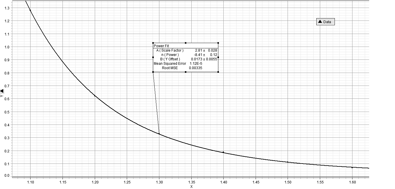
Fig. 39. The relationship between ? and Tu/Tr is shown to be inverse and non-linear, the implication being that as urbanization increases it does so at an ever increasing rate with respect to decreasing ?
Movement of the system, whether as a consequence of over-shoot, as explained previously, or simply as a result of the more normal processes of world system development, is associated with the distribution of the urbanized population and as such can be characterized by maximum urban area, by ?, and by the total population of the system itself. Further, it was previously shown that the relationship between identical maximum urban areas, ?, and lnT is linear. In other words, if maximum urban area can be predicted, the position of the world system can also be predicted as all points for the world system having a given maximum urban area will fall on the same straight line, an iso-urban line. This fact then further limits the position of the world system and can be used as a potential predictor of the position of the system.
Using these iso-urban lines as a base from which to track the movement of the world system through time allows for a polar representation of the world system trajectory. When this polar plot is inspected the change in the trajectory over time is limited to either a counter-clockwise and ever expanding (with respect to the origin of the plot) new position or a linear change in position without change in ?, that is a change in which the plot has the appearance of proceeding out of the plane of the page. These limitations are again another way of representing imposed constraints on the system, and they represent a means of prediction of the future state of the system, noting of course that the future state of the system can be viewed from any previous state of the system, that is that the future can be in the past.
Associated with the process of representing the world system trajectory in polar coordinates is the ability to represent the relationship between the parameters, H and ? themselves, and also to represent the relationship between these parameters individually over time. In all three cases, the relationships can be represented by a linear regression of the data, which implies the ability to predict in relatively specific terms. It is interesting, though, to recognize that while a linear representation of each of the relationships represents a good deal of the variability in the data, there are non-linearities, either due to phase changes of the system or periodic changes in the variables, S and ?. While there are several two-step phase changes represented in Fig. 6, in fact four, one beginning at 2500 BCE, one at 2000 BCE, one at 1000 BCE, and a final one beginning at 900 CE, and while the temporal position of these phase changes is suggestive of an exponential sequence, 500 years separating the first from the beginning of the trajectory, 500 years to the next, then 1000 years to the next, and finally 1900 years or almost 2000 years to the beginning of the final phase change, it is the aforementioned periodicities that will be discussed next.
Finally, the relationship between the observed and idealized values for maximum urban area size over time will be considered, as will the relationship between observed and expected theoretical world system space. It was shown that the graph of this data over the 5000 year history of the world system represented two distinct sets of data on urbanization, distinct in that they gave different linear regressions, but only by y-intercept, not by slope. This would seem to indicate a similar over-all process of urbanization which was simply shifted to a higher level on the graph with the beginning of the existence of the Roman Empire and shortly after that of the Han Empire. Also, when the natural logarithm of the length of the regression segment was divided into the natural logarithm of the total (abstract) distance traveled by the world system in each 2500 year section of time, the quotient, in other words the fractal dimension, of each was effectively the same. This indicates a very strong potential for prediction, since per 2500 year period the fractal dimension appears to be almost identical.
When a fractal analysis was undertaken for the relationship between observed and expected world system theoretical space, quite different results were arrived at. First, the relationship between the linear regression of the data for each 2500 year section of world system history and the entire 5000 years of that history and the actual distance traveled were considered, all the fractal dimensions were approximately 1. Second, given that this is the case, then the trajectory of the world system as represented by this ratio, that is lnD/lnR, is linear, which implies that at this scale of inspection the world system trajectory is highly constrained.
Beyond fractal analysis when the log-transformed parallel trajectory of lnT and lnCmax is considered, the relationship between these two variables seems strong and allows for further generalized prediction. First, although the variability of lnT – lnCmax ranges from approximately 5 to approximately 6.5, the regressed value is approximately 5.9. Using this average value, it is easy to extrapolate into the future. If regression yields
lnT – lnCmax = 5.9, (Eq. 35)
then maintaining the 100 year interval that the world system history is divided by permits prediction from any position on the regressed trajectory to the next position on the trajectory and also beyond the current last position of the trajectory, 2000 CE (see Fig. 40). This is not a particularly satisfactory predictive tool however, because, as was mentioned previously, there is variability in the difference, lnT – lnCmax. However, if the data on lnT and lnCmax are considered specifically, a better predictive procedure, but one that still yields approximate results, emerges. This better predictive model, let us call it the ‘abstract square model’, is represented in Figs 41a and 41b.
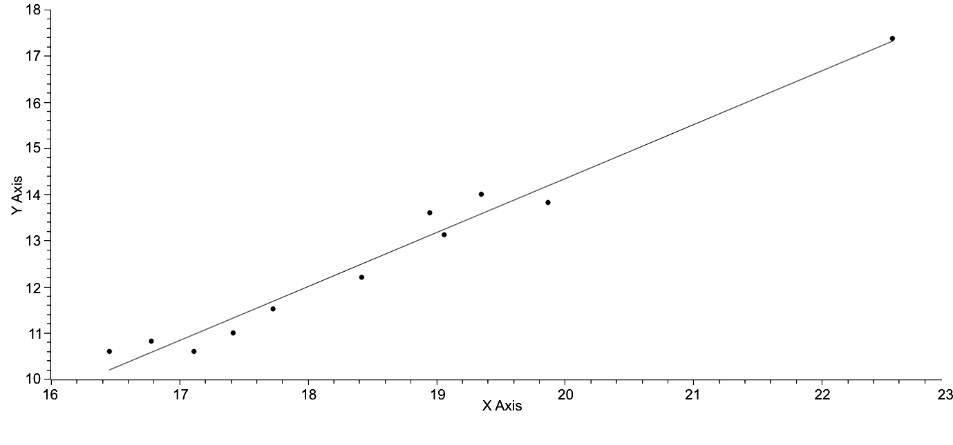
Fig. 40. lnT is represented on the x-axis, and lnCmax is represented on the y-axis. The points used to generate this regression are sets of lnT, lnCmax in 500 year increments. The regressed equation is: lnCmax= 1.1680lnT – 9.0269 (Eq. 34), R2 = .9736. If this line is extrapolated over the next 100 years the values of lnT and lnCmax are easily predictable
Note: lnT – lnCmax = Z, or lnCmax = lnT – 5.9, which is clearly an approximated version of the regression equation. Note that Z = any value between 5.0647 and 6.6846, the range of observed values of lnT – lnCmax.
Here the linear regression represented in Fig. 40 is combined with the observed limits of the system. In other words, a rectangle is created with a point representing the position of the world system as a reference. Then the range that the next generation of lnT values is determined by
lnT = lnCmax + [5 .0646 > 6.6846] (Eq. 36)
and by
lnCmax = lnT– [6.6846 > 5.0646]. (Eq. 37)
This gives a square with the dimensions, 1.6199 ? 1.6199, in which it is predicted the next generation's world system position can potentially be found. Sadly, this square has within an infinite number of points, which is hardly helpful. Can probability be used to reduce the possible number of points? Possibly. Note that this square can be subdivided into four different sections, and the sections vary in area suggesting that the probability of the position of the world system falling in any of the subsections is proportional to the area of the subsection. This is helpful but only in a general way, since each of these rectangular figures has within it an infinite number of points. If the position of the world system is calculated per century with respect to the context of this square, the position of the world system is observed to change, and since this change falls within the zero sum limits of the value, 1.6199, for both axes, then only one variable is necessary to characterize the position of the world system. Specifically, the reference of a zero sum relationship between the position of the world system within the boundaries of the square model imply that if the difference between the position of the world system and the maximum boundary of the square is known, then the other three differences between the other three boundaries are explicitly predictable, because all relationships are dependent on lnT – lnCmax = [6.6846 – 5.0647].
Fig. 41a. This is a simple representation of the general trend of the world system with respect to lnT on the x-axis and lnCmax on the y-axis. In broad terms, the predictability of the future state of the system is simply a matter of following the trend of the line. However, when the range of values between lnT and lnCmax are imposed the number of future positions of the world system becomes more varied as will be seen in Fig. 41b.
|
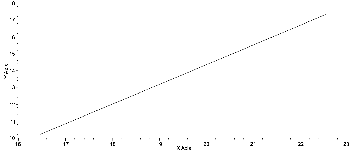
Fig. 41b. The box in the upper right hand corner of this graph represents the space delimited by the maximum and minimum values for the difference between lnT and lnCmax of all possible values that the world system position can have in 100 years from the present. Note that the position of the asterisk, the current position of the world system changes with respect to the boundaries of the square
Data for the position of lnCmax with respect to the maximum value of lnCmax as determined by lnCmax = lnT – [6.6846 > 5.0646] were used to construct the graph in Fig. 42. There are several unique features of this graph. First, the reader should understand that a vertical step representation was chosen so that the change in the difference of the observed value of lnCmax and its maximum, Z, could be represented. This plot reveals little change in the domain of Z over time, that is a linear regression would be expected to give a slope close to zero, and, in fact, the slope is .0027, very close to zero. Further, although the graph is punctuated by a number of peaks and troughs, that there is very little visual regularity to their occurrence. If peaks or maxima are defined as any increase over a previous minimum of .2 or greater on the y-axis scale of Fig. 42 then there are thirteen such maxima occurring at 2800 BCE, 2300 BCE, 2100 BCE, 1800 BCE, 1200 BCE, 900 BCE, 600 BCE, 100 BCE, 200 CE, 600 CE, 1000 CE, 1300 CE, and 2000 CE and doing so in a somewhat irregular way. It is also disconcerting to note that, while increases on the y-axis values are done incrementally and in a stepwise fashion, the decent from twelve of the thirteen maxima is done so precipitously; the decent from the thirteenth maximum has yet to occur and all of these descents may refer to what William Catton refers to as overshoot, or rather the consequences of overshoot (Catton 1982). Superficially, this data appear not to contribute much to prediction with the previous statement about overshoot excepted, however, there is some light at the end of this particular tunnel.
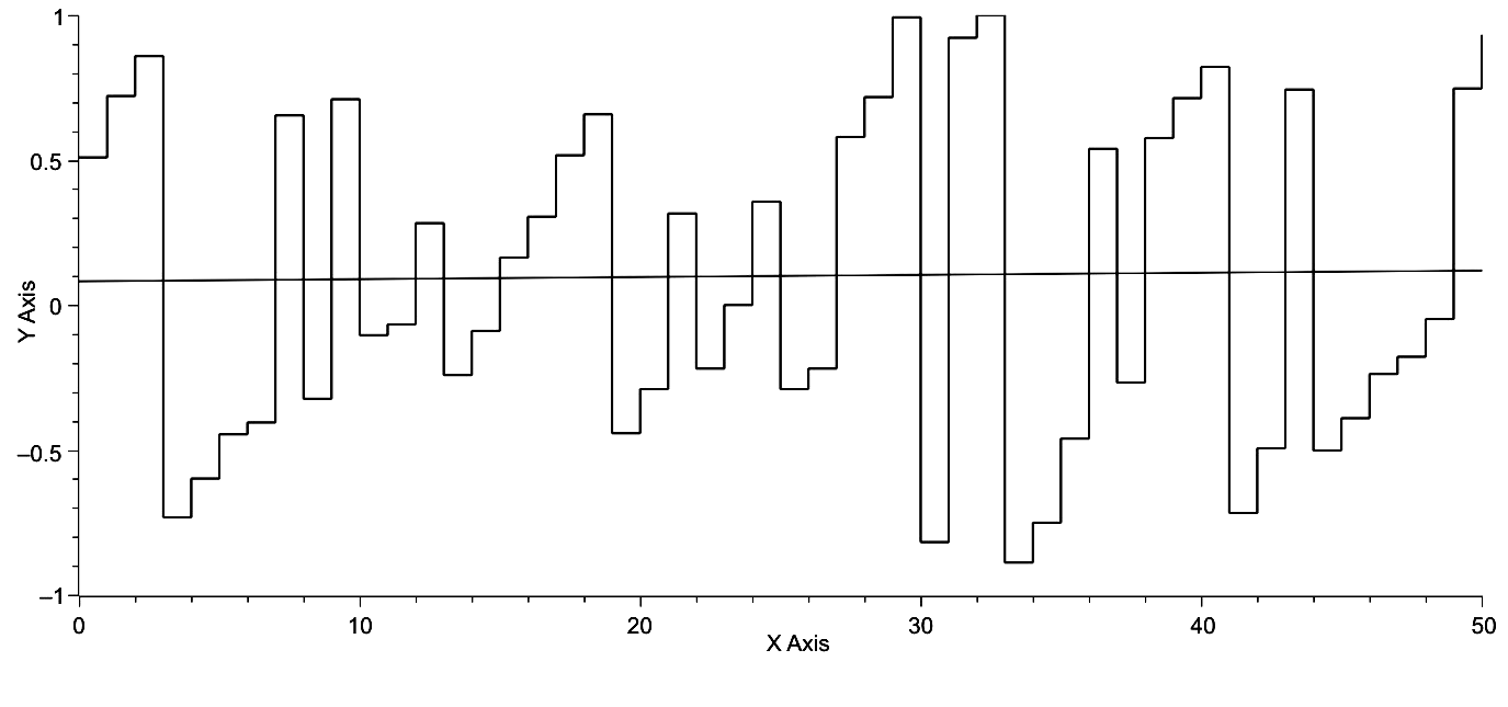
Fig. 42. Time is represented on the x-axis, and the computation, [lnCmax + 6.6846 – lnT]/1.6199, is represented on the y-axis. This computation is proportional to the position of the world system within the phase space defined by the maxima and minima of lnT – lnCmax. The regression, having a slope, m = .003, indicates that over the 5000 years of world system history investigated here these changes in the position of the world system with respect to the maximum value of lnCmax changes and does so episodically
If focus is brought to bear on the changes in y-axis values across time, and, in fact, their absolute value, a size frequency distribution can be produced as represented in Fig. 43. This distribution and the curve fit to this distribution clearly represent a pattern of exponential decay, which can be characterized by a power function with a negative exponent, e.g., y = ax–b, or an exponential function such as, F = F0 + ae–b. With regard to the specific data used to create the graph in Fig. 43 and using the actual values for the exponential form of this equation, the equation becomes,
F = 48.58881e–r/.4609 + 3.6212, (Eq. 38)
where ‘r’ is the rank of each frequency. The natural log transformation of the frequency data gives the following linear equation,
lnF = 3.9135 – 1.6999r, (Eq. 39)
the equation of a straight line as represented in Fig. 44. If the natural log transformed frequency data are plotted against class size, the linear distribution of points, as represented in Fig. 45, is the result.
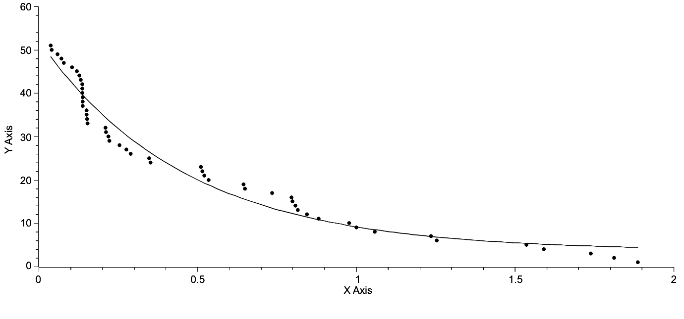
Fig. 43. Class size is represented on the x-axis, and frequency is represented on the y-axis. The regression curve is described by the equation of the form, F = F0 + Ae–x/t, where F0 = 3.6212, A = 48.5888, and t = .4609.R2 = .9667
These equations and the facts that it has been demonstrated that the world system is a non-equilibrium system and that the world system is a large, complex system both suggest that the world system exhibits self-organized criticality, SOC (Bak 2003 and else where). A random distribution of numbers over the same range was generated and coupled with the data in Fig. 43 was subjected to a two-sample t-test. The P-value of this test was P = 1.8176E-5. In other words, the probability of these two data sets being related was approximately 18 in 1,000,000, the implication being that the data showing SOC for the world system are non-random. Further and obviously, if the frequency data for Fig. 43 are natural-log transformed, a linear distribution is produced as represented in Fig. 44. Here the distribution is unquestionably linear and implies continuity of change over the range of the data but also implies the consequences of SOC, which will be discussed briefly in the following paragraph.
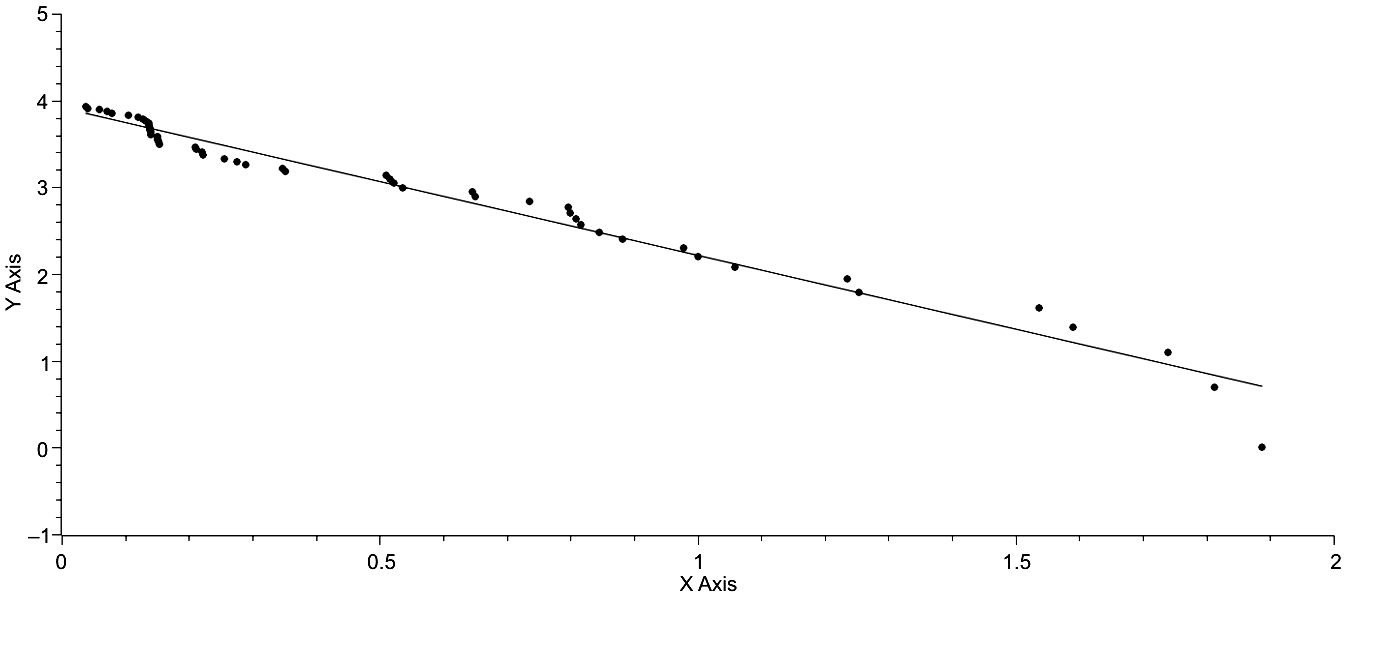
Fig. 44. Class size is represented on the x-axis, and lnF is represented on the y-axis. lnF = 3.9135 – 1.6999r, where r is the rank of the frequency (Eq. 38). R2 = .9716
The consequences of a system exhibiting SOC are significant. First, periods of rapid urbanization and de-urbanization are punctuated by periods of relative stasis. This pattern is also exhibited in the second section of this paper discussing the polar plot representation of the world system, specifically in Figs 12 and 13. Second, the pattern of systems exhibiting SOC can be represented by a simple power function or exponential function as is the case here. Third, this pattern is continuous, as is clearly represented in both Figs 44 and 45, and consequently there is no difference in the factors that cause small events of urbanization and those that cause major events of urbanization. Fourth, the timing of these events individually is not predictable, either with regard to increased or decreased urbanization. This was suggested and only suggested by the temporal distribution of maxima in Fig. 42. While these data then are suggestive of regularity, they are not suggestive of explicit temporal predictability, however, the inference that the world system exhibits SOC is itself a prediction in terms of the behavior of the system.
In conclusion, what are the actual implications of this section for predictability? First, the original trajectory of the world system in its natural log-transformed state yields a relatively linear regression with some significant digressions from linearity as have already been mentioned. So, in general, the extension of the regression gives an approximate prediction of the future of the system, and the same holds true for postdictions. However, if one were making a prediction for the future of the system in 500 BCE or, say, 1300 CE, in terms of linearity the prediction would be wildly wrong. In both instances very rapid urbanization occurs in the face of very little or no increase in lnT, the consequence for the trajectory being that it takes very sharp right turns at both 500 BCE and 1300 BCE, clearly events that do not fit the trend of the linear model. So, the linear model is of limited use.
A more detailed study of the trajectory reveals that iso-urban lines exist, in other words, that regarding the graph of ? v. lnT points of identical maximum urban area magnitude align linearly. This in itself is of course a prediction. If the current state of the system were to revert to a maximum urban area size of 1,000,000, then the position of the system would fall somewhere on the iso-urban line with m = .0910 and b = –.4430. Consulting Fig. 4 will allow the reader to estimate the current position of the world system if this reversion in maximum urban area size were to occur with no change in lnT. Again, any prediction using iso-urban lines would be far from explicit.
In turn, the iso-urban lines were used as a basis for constructing a polar plot of the world system trajectory, an ever expanding spiral subject to the changes in both X = Scos? and Y = Ssin?, the parametric equations for the plot. A three dimensional polar plot reveals a relative degree of regularity in the system. Given a couple of two-dimensional perspectives, it is quite clear that a relatively linear increase in maxima occurs, and the same may be stated for minima. Further, when both X and Y are plotted against time their maxima occur in a predictable fashion and, in general, so do the minima. If S and ? are plotted against one another, a near-linear plot is achieved, however, there are clear punctuations in this graph in which S changes rapidly while ? does not change at all. This behavior of the world system represents punctuations in change alternating with relative stasis and is characteristic of a number of biological systems. In itself, this characteristic of the world system is predictive of general, over-all prediction but not explicit prediction.
When maximum urban area size is compared with optimal urban area size a clear trend is revealed with decreasing ?, in that the two values approach one another. The ratio of these two values, Cmax/Cmax(? + 1)/2, when plotted against time clearly reveals a disjunct graph, one in which the Ancient World is separated by a phase change in maximum urban area magnitude from the Classical and Modern Worlds. This phase change occurs during a period of time that roughly coincides with Karl Jasper's Axial Age, but the graph and the data behind the graph do not explain why this phase change occurred when it did. It is interesting to note here that the world system may be entering another period of phase change, however, aside from the periodicity of these two events being approximately 2500 years in length, there is little reliance at present that can be placed on a data set of only two events. It is interesting, however, that when a simple fractal analysis is applied to this data that the fractal dimensions of both are nearly identical. This is, in one sense, intellectually comforting, but again does not lend itself to explicit prediction.
When the separate trajectories of both lnT and lnCmax are compared they appear nearly linear and parallel to one another. This is confirmed by calculating the differences between the linear regressions of both trajectories. However, the observed data vary in the difference of their magnitude by 1.6199, a significant variance when one deals with log-transformed data. While the general relationship between lnT and lnCmax is linear, when the variability between lnT and lnCmax makes the prediction within that range of variability for both lnT and lnCmax less possible (see Fig. 41b). Over time the position of the world system varies with respect to the boundaries of the variability. This variability opens the door to a new perspective on the behavior of the world system and the predictability of that behavior.
When this variance in position of the world system with respect to the boundaries of the variance in the difference between lnT and lnCmax is plotted against time and is represented as a vertical series of steps, it is quite clear that the average slope of this graph (Fig. 42.) is nearly zero. But, when a size frequency distribution of the absolute values of the vertical steps is constructed, the result is a curve exhibiting decay, which can be represented by either a power function or an exponential function. Given that the world system is a large, complex, non-equilibrium system, this result implies that the world system exhibits self-organized criticality. There are three important consequences of this implication. First, the factors that both increase and decrease rates of urbanization are similar for all magnitudes of urbanization. Second, it should be expected that periods of urbanization are episodic. Third, these periods of episodic urbanization appear not to be temporally predictable.
This research paper closes with two concerns: First, somewhat conflicting data have been presented with regard to the predictability of the world system trajectory as it is understood over the last 5000 years of its history. Unquestionably, much more research is required to resolve this disparity, however, personally my intuition tells me that further study of the potential for the world system to exhibit SOC, self-organized critically, will be quite productive. Second, Fig. 43 reveals a pattern of change in which increase in urbanization with respect to the total population of the world system is for the most part done incrementally. However, change in the opposite direction is not, it occurs precipitously. If these data are correct there are two further consequences, that the timing of these down turns is episodic and may not be predictable, and that the magnitudes of the down turns is quite large.
Summary
1. The intent of this paper is to show, first, that the trajectory of the world system is highly constrained, and, second, that these constraints lead to the possibility of prediction, that is that the position of the world system at any point on its trajectory is potentially predictable based on the nature of the constraints analysed.
2. The organization of the world system was described in terms of the relationship between ?, a parameter that generalizes the distribution of urban areas for any given maximum urban area and the total population of the system.
3. Several types of constraint on the world system trajectory were recognized. Specifically, the overall trend of the system and the existence of iso-urban lines were discussed.
4. The trajectory of the world system was reconfigured in polar dimensions, the morphology of this plot was described, and the changes over time with respect to the polar parameters were noted, and any non-linearities, either of a punctuated or periodic nature were analysed.
5. A standard, the idealized maximum urban area, was established and a ratio was generated with the observed maximum urban area divided by the standard. This allowed the recognition of two distinct phases of urbanization and, further, on generating separate regressions for each phase of urbanization it was shown that the fractal dimension of each was essentially the same.
6. As in #5 a standard was established for total potential area of the world system and the actual potential area of the system at each point in time could then be used to generate a ratio of the standard to the actual so that any significant trends in world system activity could be represented. Fractal analysis was performed, and it was shown that the fractal dimension for both the 2500 year periods and the entire extent of world system history did not vary significantly from unity. This fact has significance with regard to prediction of the world system trajectory into the future.
7. The parallel trajectories of the world system population as a whole and that of maximum urban areas of that system was analysed, and it was shown that the difference between the natural log-transformed values for both variables falls within a range of values the difference of which is 1.6199.
8. The data on the parallel trajectories of both the natural log-transformed world system population and maximum urban area sizes exhibit properties of self-organized criticality. The consequences of complex systems exhibiting SOC are discussed.
9. The potential of using these constraints and conditions to predict past, present, and future positions of the world system was noted in terms of each of the constraints analysed and each constraint was assessed for its particular contribution to understanding the (future) state of the system.
References
Anderson P. W. 1972. More is Different. Science 177: 393–396.
Arrighi G. 1994. The Long Twentieth Century: Money, Power, and the Origins of Our Times. New York: Verso.
Bak P. 1996. How Nature Works. New York: Copernicus Springer-Verlag.
Bak P., Tang C., and Wiesenfeld K. 1987. Self-Organized Criticality: An Explanation of 1/f Noise. Physical Review Letters 59: 381–384.
Catton W. R. Jr. 1982. Overshoot: The Ecological Basis of Revolutionary Change. Chicago, IL: University of Illinois Press.
Cohen J. 1995. How Many People Can the Earth Support? New York: W. W. Norton and Company.
von Forester H., Mora P. M., and Amiot L. W. 1960. Doomsday: Friday 13th, November, A.D. 2026. Science 134(3436): 1291–1295.
Grinin L. 2012. Macrohistory and Globalization. Volgograd: Uchitel Publishing House.
Grinin L., and Korotayev A. 2006. Political Development of the World System: A Formal Quantitative Analysis. History and Mathematics. Historical Dynamics and Development of Complex Societies / Ed. by P. Turchin, L. Grinin, A. Korotayev, V. de Munck, pp. 115–153. Moscow: KomKniga/URSS.
Harper T. 2010a. The Macropattern of Urbanization over the Course of the Last 5000 Years of World-System History. Social Evolution & History 9(1): 115–133.
Harper T. 2010b. The Trajectory of the World System over the Last 5000 Years. History and Mathematics: Processes and Models of Global Dynamics / Ed. by L. Grinin, P. Herrmann, A. Korotayev, and A. Tausch, pp. 13–63. Volgograd: Uchitel.
Hutchinson G. E. 1978. An Introduction to Population Ecology. New Haven, CT: Yale University Press.
Korotayev A. 2010. Globalization and Mathematical Modeling of Global Development. Hierarchy and Power: Political Aspects of Modernity / Ed. by L. Grinin, D. Beliaev, and A. Korotayev, pp. 225–240. Moscow: LIBROCOM/URSS.
Korotayev A., and Grinin L. 2006. Urbanization and Political Development of the World System: A Comparative Quantitative Analysis. History and Mathematics: Historical Dynamics and Development of Complex Societies / Ed. by P. Turchin, L. Grinin, V. de Munck, and A. Korotayev, pp. 115–153. Moscow: KomKniga.
Korotayev A., and Grinin L. 2013. Urbanization and Political Development of the World System. Entelequia 5: 197–254.
Korotayev A., Malkov A., and Khaltourina D. 2006a. Introduction to Social Macrodynamics: Compact Macromodels of the World System Growth. Moscow: URSS.
Korotayev A., Malkov A., and Khaltourina D. 2006b. Introduction to Social Macrodynamics: Secular Cycles and Millennial Trends. Moscow: URSS.
Korotayev A., Malkov A., and Khaltourina D. 2006c. Introduction to Social Macrodynamics: Secular Cycles and Millennial Trends in Africa. Moscow: URSS.
Li C. C. 1955. Population Genetics. Chicago, IL: University of Chicago Press.
Malthus T. H. 1798. An Essay on the Principle of Population. The Project Gutenberg. URL: http://www.gutenberg.org/.
Mayr E. 1988. Toward a New Philosophy of Biology: Observations of an Evolutionist. Cambridge: Belknap Press of Harvard University Press.
Modelski G. 2003. World Cities: –3000 to 2000. Cheshire, CT: Faros 2000.
Stavrianos L. S. 1976. The Promise of the Coming Dark Age. San Francisco: W. H. Freeman and Company.
Mathematical Appendix
The Derivation of T/Cmax = (Cmax?– 1 – 1)/(? – 1).
From Eq. 2, Cmax? – Cmax – (? – 1)T = 0, it can be seen that Cmax? – Cmax = = (? – 1)T, and that T = (Cmax? – Cmax)/(? – 1). If Cmax is factored out of the numerator and both sides of the equation are divided by Cmax, this will yield: T/Cmax = (Cmax?– 1 – 1)/(? – 1).
The Derivation of [e5.9 – .0078t – 1]/[? e5.9 – .0078t – Cmax? – 1] = 1.
The linear regressions of lnT and lnCmax yield respectively, lnT = 16.1681 – – .0826t and lnCmax = 10.2681 – .0904t. Consequently, lnT – lnCmax = 5.9 – – .0078t, and, further, T/Cmax = e5.9 – .0078t. As a result e5.9 – .0078t = [Cmax? – 1 – 1]/ [? – 1] and [? – 1]e5.9 – .0078t = [Cmax? – 1 – 1]. Rearrangement gives: ? e5.9 – .0078t– – Cmax? – 1 = e5.9 – .0078t – 1, and dividing both sides by ? e5.9 – .0078t – Cmax? – 1 yields: [e5.9 – .0078t – 1]/[? e5.9 – .0078t – Cmax? – 1] = 1.The expected value of this ratio is clearly 1.0, and the observed value at each 100 year increment can be calculated using appropriate values substituted for each variable of the ratio.
[1] The data set on which this last statement is made is not exceptionally large, and, consequently, making a statement such as this last one comes at some risk. My salvation is that none of us will be here 1000 years from now, however, hopefully the world system will be!
[2] The reader should be aware that the data in Fig. 14 have not been normalized.